

Results 151 to 180 of 1478
Thread: OotS Style Art/Fanart Showcase V
-
2012-10-10, 05:53 PM (ISO 8601)Bugbear in the Playground

- Join Date
- Mar 2009
- Location
- Here.
 Re: OotS Style Art/Fanart Showcase V
I don't know how much value my opinion has, but I'll give this a shot.
Re: OotS Style Art/Fanart Showcase V
I don't know how much value my opinion has, but I'll give this a shot. Originally Posted by Promise

Even if you do decide to use colored outlines (it's actually quite tricky to pull off), having darker outlines are a must. If you look at drawings using more conceptualized styles (anime art on deviantart, for example), a lot of them depend on either heavy contrast or a light boundary to divide between a foreground object and the ambiance; with something as abstract as OotS style, you really need a darker border on, say, the head to make it meld well with the sidebar color (following suit on the rest of the avatar for consistency).
Right now, the trail on the sword clashes a bit with the rest of the avatar; the trails do not seem to follow any natural path that a sword attack would follow (right now, it gives the impression that the sword started in a horizontal position and is simultaneously swung and pivoted at the same time; it also seems like the character is trying to hit with the flat of his blade). If you just wanted to indicate motion and want to keep the avatar relatively simple, I would shorten the trail by quite a bit; instead of making it a full arc, make it either a few lines following the blade or a relatively linear, shorter trail to indicate a downward swing of the blade.
If you were going for full depth and trying to portray a horizontal swipe, I would use this OotS comic as a guideline. Basically, the trailing effect should follow the logical path of the blade rather than just an arc that ends at the blade's location. It might help to place copies of the sword at various points of the swing to act as a guide for how to draw the sword trails.
We might be able to point you to a few better examples of a specific pose or motion if you could tell us how you envisioned the character's pose.
And definitely, an oval shape for the shield. The character seems to be facing a threat to the viewer's right, so it's appropriate if the shield is also pointed in that direction rather than at the character's side.
For the looking evil part, it may sound a bit cliche, but on that avatar, changing the character's expression to an extreme grin, as well as adding the "shocked" lines to the eyes, is probably your best bet for a character in combat. Other ways to indicate evil would be blood (invokes images of a blood knight), demon imagery, skulls, dark or pallid color schemes, or physical distortion (scars, poxes, hunchback, and other things that move the character towards the uncanny valley).
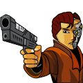
I usually use 2px for the eyes and 4px for the rest of the body (although I also draw my avatars using a 300x300 canvas). My 2px is with a 50% blurred edge, though, so it might translate a little differently on inkscape. Originally Posted by Teutonic Knight
*steals August's talent with weird alien device* Originally Posted by araveugnitsuga
Last edited by Felyndiira; 2012-10-10 at 06:02 PM.
-
2012-10-10, 06:53 PM (ISO 8601)Ogre in the Playground
- Join Date
- Jul 2012
- Location
- Lost in my imagination
Re: OotS Style Art/Fanart Showcase V
New Avatar? New avatar.

-
2012-10-11, 06:36 AM (ISO 8601)Pixie in the Playground

- Join Date
- Aug 2012
Re: OotS Style Art/Fanart Showcase V
I've worked on everything mentioned (I think) except the pose and trail.

I also tried to tweak the swords angle a bit, to make it look more as if the sword is being swiped passed his head, I don't think it looks right. I actually think it looks worse, so I guess I'll have to fix that.
Here's basically the "arc" I wanted it to appear as if the sword was following, from an almost sheathed position, to past the head. Basically imagine if someone was trying to cut an arrow out of the air with a sword. (Unlikely, but there you go.)

As for the pose, he's meant to be falling back on one foot while pushing forwards with the other. Think of if he was actually blocking instead of swinging, and his opponent was pushing down on his sword, almost like a one legged crouch.Ninjatar by me.
My art thread.. Please come help me :smallredface
http://www.giantitp.com/forums/showt...2#post14472052
-
2012-10-11, 10:51 PM (ISO 8601)Barbarian in the Playground
- Join Date
- Feb 2009
- Location
- Right here, duh
- Gender

Re: OotS Style Art/Fanart Showcase V
So I sort of made a thing that wasn't an avatar for once.
Spoiler
Any thoughts?Pseudo-Luigi of the Solt Lorkyurg Fanclub.
Spoiler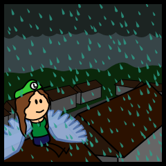
Originally Posted by Sgeo
-
2012-10-11, 10:54 PM (ISO 8601)Troll in the Playground

- Join Date
- May 2012
- Location
- California
- Gender

Re: OotS Style Art/Fanart Showcase V
Does it have any arms?
Spoiler: Quote(s) Originally Posted by Temotei
Originally Posted by Kneenibble
Originally Posted by FinnLassie
"So whosoever is a hedgehog let him see to it that his wife is a hedgehog also, and so forth."
-
2012-10-11, 10:56 PM (ISO 8601)Barbarian in the Playground
- Join Date
- Feb 2009
- Location
- Right here, duh
- Gender
Re: OotS Style Art/Fanart Showcase V
Yes, they're right in front of her, hands together. A bit hard to tell with the colored stroke look, I guess. Darnit.
Pseudo-Luigi of the Solt Lorkyurg Fanclub.
Spoiler
Originally Posted by Sgeo
-
2012-10-12, 10:11 AM (ISO 8601)Troll in the Playground
- Join Date
- May 2012
- Location
- California
- Gender
Re: OotS Style Art/Fanart Showcase V
Oooh.... they're way too high up. I think lowering would make them not look like a necklace.
Spoiler: Quote(s) Originally Posted by Temotei
Originally Posted by Kneenibble
Originally Posted by FinnLassie
"So whosoever is a hedgehog let him see to it that his wife is a hedgehog also, and so forth."
-
2012-10-12, 11:32 AM (ISO 8601)Barbarian in the Playground
- Join Date
- Feb 2009
- Location
- Right here, duh
- Gender
Re: OotS Style Art/Fanart Showcase V
Okay... any better now, maybe?
Spoiler
...To be honest, it'd probably be better if I could think of a different position for the arms to be in.Last edited by CapedLuigiYoshi; 2012-10-12 at 11:33 AM.
Pseudo-Luigi of the Solt Lorkyurg Fanclub.
Spoiler
Originally Posted by Sgeo
-
2012-10-12, 03:04 PM (ISO 8601)Retired Mod in the Playground Retired Moderator

- Join Date
- Feb 2010
- Location
- Texas. It's too hot here.
- Gender

Re: OotS Style Art/Fanart Showcase V
I think part of the problem is those green things on her outfit. Are they supposed to be sleeves? If so, her arms should come out from under them, not go over them. If they're not sleeves, I'm not sure what they are, and they look quite uncomfortable in their current position.
Also, you have the most natural cleavage I've seen on an OotS-style avatar -- I like it.Knowledge is power.
Power corrupts.
Study hard.
Be evil.
-
2012-10-12, 09:00 PM (ISO 8601)Troll in the Playground
- Join Date
- May 2012
- Location
- California
- Gender
Re: OotS Style Art/Fanart Showcase V
Cape, with Oots-style, you might want to move the head and arms down closer to the top of the apparel.
Also, I know this isn't Oots-style, but what do you think about my avatar?Spoiler: Quote(s) Originally Posted by Temotei
Originally Posted by Kneenibble
Originally Posted by FinnLassie
"So whosoever is a hedgehog let him see to it that his wife is a hedgehog also, and so forth."
-
2012-10-12, 09:09 PM (ISO 8601)Barbarian in the Playground
- Join Date
- Feb 2009
- Location
- Right here, duh
- Gender
Re: OotS Style Art/Fanart Showcase V
Well, the outfit is based on a certain Pokemon. I originally planned for then to be shoulder... things, but I wasn't sure how to fit it snugly by the head and look good. I wasn't too happy with them either, to be honest. Originally Posted by Savannah
Thanks.Also, you have the most natural cleavage I've seen on an OotS-style avatar -- I like it.
I'd rather move the apparel up, if I can manage to figure out how to make it look good. Originally Posted by Cuthalion
Looks really nice, yeah.Also, I know this isn't Oots-style, but what do you think about my avatar?Pseudo-Luigi of the Solt Lorkyurg Fanclub.
Spoiler
Originally Posted by Sgeo
-
2012-10-12, 09:52 PM (ISO 8601)Retired Mod in the Playground Retired Moderator
- Join Date
- Feb 2010
- Location
- Texas. It's too hot here.
- Gender
Re: OotS Style Art/Fanart Showcase V
I would try treating them as large off-the-shoulder sleeves and just have her arms coming out from underneath (and slightly visible on top). Originally Posted by CapedLuigiYoshi
Knowledge is power.
Power corrupts.
Study hard.
Be evil.
-
2012-10-12, 10:06 PM (ISO 8601)Barbarian in the Playground
- Join Date
- Feb 2009
- Location
- Right here, duh
- Gender
Re: OotS Style Art/Fanart Showcase V
Hmm... i think I've got some form of progress there.
Spoiler
Alternatively, I made an armless version for comparison.
Spoiler
Last edited by CapedLuigiYoshi; 2012-10-12 at 10:06 PM.
Pseudo-Luigi of the Solt Lorkyurg Fanclub.
Spoiler
Originally Posted by Sgeo
-
2012-10-12, 11:18 PM (ISO 8601)Troll in the Playground
- Join Date
- May 2012
- Location
- California
- Gender
Re: OotS Style Art/Fanart Showcase V
Much better. By the way, my avatar took forever to make. Inkscape is not the fastest program ever. For making machines.
Spoiler: Quote(s) Originally Posted by Temotei
Originally Posted by Kneenibble
Originally Posted by FinnLassie
"So whosoever is a hedgehog let him see to it that his wife is a hedgehog also, and so forth."
-
2012-10-12, 11:47 PM (ISO 8601)Barbarian in the Playground
- Join Date
- Feb 2009
- Location
- Right here, duh
- Gender
Re: OotS Style Art/Fanart Showcase V
Yeah, when enough gets put together in the same place, the program can get a bit slow...
Anything else you think I should touch up?Pseudo-Luigi of the Solt Lorkyurg Fanclub.
Spoiler
Originally Posted by Sgeo
-
2012-10-13, 08:44 AM (ISO 8601)Troll in the Playground
- Join Date
- May 2012
- Location
- California
- Gender
Re: OotS Style Art/Fanart Showcase V
The hair looks sorta like it stops as shorter-long hair and then randomly continues again. Doesn't flow.
Spoiler: Quote(s) Originally Posted by Temotei
Originally Posted by Kneenibble
Originally Posted by FinnLassie
"So whosoever is a hedgehog let him see to it that his wife is a hedgehog also, and so forth."
-
2012-10-13, 10:44 AM (ISO 8601)Ogre in the Playground
- Join Date
- Sep 2009
- Location
- Beyond the Wall
- Gender
Re: OotS Style Art/Fanart Showcase V
I have to disagree with Cuthalion. I think the overall look of the hair is great. What I would recommend, however, it to make it some the hair doesn't perfectly match the top of the head. Hair is going to stick up off a person's head a bit, even when it's sitting flat.
-
2012-10-13, 04:05 PM (ISO 8601)Barbarian in the Playground
- Join Date
- Feb 2009
- Location
- Right here, duh
- Gender
Re: OotS Style Art/Fanart Showcase V
Adjusted the hair upward and a bit outward. Hopefully it looks like it has the proper volume now.
Spoiler Pseudo-Luigi of the Solt Lorkyurg Fanclub.
Spoiler
Originally Posted by Sgeo
-
2012-10-13, 07:03 PM (ISO 8601)Halfling in the Playground

- Join Date
- Oct 2007
Re: OotS Style Art/Fanart Showcase V
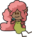
The antagonists of my under-construction fancomic.

Strike me with your lightning bolts of arcane knowledge of artistry!
-
2012-10-14, 09:27 AM (ISO 8601)Troll in the Playground
- Join Date
- May 2012
- Location
- California
- Gender
Re: OotS Style Art/Fanart Showcase V
The lines are too thin. Their sword should go down at an angle, rather than straight out.
Spoiler: Quote(s) Originally Posted by Temotei
Originally Posted by Kneenibble
Originally Posted by FinnLassie
"So whosoever is a hedgehog let him see to it that his wife is a hedgehog also, and so forth."
-
2012-10-14, 12:15 PM (ISO 8601)Bugbear in the Playground
- Join Date
- Jun 2010
- Location
- Not in a secret base, no!
Re: OotS Style Art/Fanart Showcase V
I have to say I really like this picture, even the first version was great in my opinion. I only wondered how the arms would look like if you make them black instead of the current color. Originally Posted by CapedLuigiYoshi
Grammer is my declared deadly enemy!
Avatar by Ceika
Let's PLay's in German Take a Look at Bravely Default.
Nexus Characters: LINK
-
2012-10-14, 02:48 PM (ISO 8601)Barbarian in the Playground
- Join Date
- Feb 2009
- Location
- Right here, duh
- Gender
Re: OotS Style Art/Fanart Showcase V
...Okay, I tried that earlier, but... I honestly think it looks worse. Too mismatched with the look of the rest of the picture. Originally Posted by Zefir
I have considered making the two arms slightly different shades, though.Pseudo-Luigi of the Solt Lorkyurg Fanclub.
Spoiler
Originally Posted by Sgeo
-
2012-10-15, 12:28 PM (ISO 8601)Troll in the Playground

- Join Date
- Nov 2008
- Gender
Re: OotS Style Art/Fanart Showcase V
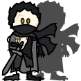
Okies folks, I'm in need of a bit of help. Working on a new project for someone and I really want to get the base shape right. It's going to be an assassin with sickle and chain with pose based on this.
I'm pretty sure I have to reposition the facial features a bit; but there's other stuff off about it and the whole avi just doesn't seem to tie together into the pose well. Any suggestions, hints, tips?
Spoiler
Last edited by Astrella; 2012-10-15 at 12:28 PM.
-
2012-10-15, 01:46 PM (ISO 8601)Ogre in the Playground
- Join Date
- Aug 2007
Re: OotS Style Art/Fanart Showcase V
Incredibly biased personal preference incoming: Have you tried making a version with only black lines? Originally Posted by CapedLuigiYoshi
Colored outlines are fantastic in moderation, e.g. on eyes, or on fine details. But in 9/10 cases having a full color outline looks incredibly mismatched in general.
Especially if you use a black outline on the eyes and the mouth while everything else is colored.
Anatomy has always been a weak point for me, no matter what style, but I'm sure his feet are too tiny. You also could to curve the sides of his torso slightly to the side so it looks like he's bending into the kneel. Originally Posted by Astrella
As for the pose, I feel that it will tie itself together once you have some details and clothes on him that define the body and the way it's facing. On personal preference, I'd also move the eyes/mouth just a touch closer to the middle of his head. So he isn't looking too strongly off to the side.
That's all I can think of for now. *shrugs*Last edited by Tiffanie Lirle; 2012-10-15 at 02:03 PM.
-
2012-10-15, 01:55 PM (ISO 8601)Troll in the Playground

- Join Date
- Apr 2009
- Location
- ??Ph??
Re: OotS Style Art/Fanart Showcase V
I believe this is the kind of situation where you can allow yourself to deviate from the original style a bit and, as tiphany said, curve the torso a bit
Last edited by smuchmuch; 2012-10-15 at 06:14 PM.
I'm sig'ing in the rain, just sig'ing in the rain....
Somme old avatars, by meSpoiler
 -
-
-
2012-10-15, 03:37 PM (ISO 8601)Barbarian in the Playground
- Join Date
- Feb 2009
- Location
- Right here, duh
- Gender
Re: OotS Style Art/Fanart Showcase V
Well, technically the mouth was using a dark brown outline, but I understand what you're saying. How's this, then? Originally Posted by Tiffanie Lirle
Spoiler Pseudo-Luigi of the Solt Lorkyurg Fanclub.
Spoiler
Originally Posted by Sgeo
-
2012-10-15, 04:07 PM (ISO 8601)Ogre in the Playground

- Join Date
- Apr 2008
- Location
- At work
- Gender
Re: OotS Style Art/Fanart Showcase V
I'd say that it is one of the nine cases.


-
2012-10-15, 06:02 PM (ISO 8601)Ogre in the Playground
- Join Date
- Sep 2009
- Location
- Beyond the Wall
- Gender
Re: OotS Style Art/Fanart Showcase V
I actually prefer this version with the black outlines. Maybe it's just personal opinion, but I think black outlines generally look better. Originally Posted by CapedLuigiYoshi
-
2012-10-15, 07:10 PM (ISO 8601)Troll in the Playground
- Join Date
- May 2012
- Location
- California
- Gender
Re: OotS Style Art/Fanart Showcase V
I, too, approve of this one more.
Spoiler: Quote(s) Originally Posted by Temotei
Originally Posted by Kneenibble
Originally Posted by FinnLassie
"So whosoever is a hedgehog let him see to it that his wife is a hedgehog also, and so forth."
-
2012-10-15, 09:06 PM (ISO 8601)Barbarian in the Playground
- Join Date
- Feb 2009
- Location
- Right here, duh
- Gender
Re: OotS Style Art/Fanart Showcase V
Alright, thanks.
So, I recolored the lines in the hair and extended the tail a bit to be more accurate to the source. I think this'll be the final version.
Spoiler
And another armless version just because.
Spoiler
Pseudo-Luigi of the Solt Lorkyurg Fanclub.
Spoiler
Originally Posted by Sgeo


 Reply With Quote


 RSS Feeds:
