
Originally Posted by
Teutonic Knight

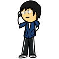
Ok this is what I could come up with following the Tsofu method of sketching. scanning, and curve-pointing custom line size adjusting.
Me:
And it always comes out in low image quality.

I should start instead with pre-made characters, that should give a better indication if I've improved or gained any bit of skill in this. Or maybe I just suck at sketching in OotS-style. Ponder ponder ponder.
It may be your monitor being analog or digital (analog looks clearer and colours are easier to distinguish, digital is a lot cleaner in many senses of vision, mainly anti-aliasing is more noticeable.).
Drawing real not-cosplaying people in OoTS Style normally doesn't yield spectacular results, since its based mainly in clothing and hair, both of which the standard human does not vary much from some basics (excluding certain groups of individuals and madmen/women). Hair also is hard to spruce up unless you go to anime style for a crutch and the OoTSize it.
Previously made characters are normally the test, if it looks better you've improved. I dropped pastel outlines after running Ribonis through it once.
Finally, what Tsofu said mainly, sketching is useful if you decide for it to have a purpose, it can be A->B, where you sketch to get better digital versions, or B->A where you sketch to gain practice in manual crafts, and do it before to see how digitally you would have liked it to come out. Or A<->B, were both skills augment simultaneously one thanks to the other, though it can require certain theoretical investments of time into drawing theory.
I sketch in animeish style to get better at it, and then I make a OoTS version of it by the side. Anime style forces me to abstract certain things and expressions, as well as give me a full view of posture and column flow, or gives me freedom to twist posture and make hair dynamic. Then OoTS forces me to further abstract elements and reduce it to the bare basics (which sometimes even then is too much detail). Then I scan.
Obviously I only do this for a certain number of avatars, and then its mainly in the interest of repositioning or studying posture. Otherwise it's reference simplification on screen, or template element adding (this last solution is now lost to me for good).
_ _ _ _ _ _ _ _ _ _ _
If you aren't satisfied with your end results, analyse what's behind them (or go to the Rate an Avatar at the SMBG and hope someone else notices). The main factors are Flow, Dynamism, Technique and Colouring.
Flow is how lines move around your image, how a cape trails off and twists in the air, and how straight lines cut flow. Dresden Codak blog had a great blog post about how flow works and can be used. Clothing can be made to flow, to add a sense of movement to it, or forced straight to clash with some flowing element like the hair.
Dynamism is related to posture and action. Where is it looking and what is it doing, but there are additional elements. Posture is mainly the nearest you'll get to anatomy in OoTS art, torso twisting, shoulder lowering, crouching, jumping. While it is severely simplified, there still is a spinal chord in your drawing, from where appendages will come off (arms, legs and head) and from which clothing will bend around. Action is also rather important, a still character looking to the front is great if you want to study the pieces, but not as a final avatar. 3/4 simulates some movement by itself, but it isn't enough by itself most of the times. Adding dynamism is changing elements away from standing still looking to the front, to fully explain it would take a whole book, but looking at still shots from manga, anime and action movies and analysing how things are bending, moving, and looking might help to simulate dynamism on a still image.
Technique is related to software, hardware and style.
Software is the least obvious one, but certain programs will nudge you toward certain tools. Paint has less tools than most programs, so some obvious things like layering for most are not there, forcing a different approach. Inkscape is full vector, it has certain presets, for once, lines are always formed in the middle of the stroke, softening lines is hard, and using tools apart from the basic ones is risky due to crashes. Fireworks auto-softens lines, and due to being raster/vector, when you zoom, you see vectors degenerate, despite this not happening if you scale them up, meaning you either work bigger, or zooming in is misleading, also, lines auto-soften, and path extrusion is a lot more specialized and command based than a simple click.
Hardware is one of the most noticeable ones in other styles and programs, but it mainly boils down to tablet or mouse, vectors favours the last, if you do backgrounds then things get weird.
Style, apart from it being OoTS, there are certain unofficial subschools, that mainly go from Cartoony to Realistic, and have internal subdivisions in terms of what is rendered and what implied (shading or no shading, detailed clothes or shapes, hair strands or hair mass, head to body proportions, body proportions themselves...).
Finally Colouring, it mainly goes with colour theory or an unnoticed understanding of it, going on and on about colour would take a rather long while, and this post is already massive, but it mainly is about saturation preferences and combinations of hue and contrast, and vibrancy, and on and on.


 Re: OotS Style Art/Fanart Showcase IV

 Reply With Quote