Results 1 to 12 of 12
Thread: Please critique my new avatar!
-
2017-08-03, 04:12 PM (ISO 8601)Ogre in the Playground

- Join Date
- Jul 2014
- Gender

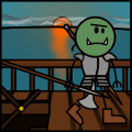
 Please critique my new avatar!
Drawn by yours truly in Inkscape.
I wanted it to be a cross between the old and the new OotS styles, with some extra realism thrown in (weapons and armor, mostly).
Please tell me what you can gather from the image, to know if I managed to convey my mental image on such a small scale, and what, if anything, feels off
Thanks!
Last edited by wkwkwkwk1; 2017-08-04 at 05:13 AM.
Avatar by yours truly
Spoiler: Links & GitP Quotes Originally Posted by fyleisch
 10 Commandments of Op./Practical Op. Originally Posted by Dark Shadow
3.5 WBL/GP
Cleric Domains
-
2017-08-03, 05:42 PM (ISO 8601)Dwarf in the Playground
- Join Date
- Nov 2014
- Gender
Re: Please critique my new avatar!
Looks cool, loved the sunset detail.
-
2017-08-04, 12:27 AM (ISO 8601)Firbolg in the Playground

- Join Date
- Apr 2007
- Location
- NO LONGER IN CHINA!
Re: Please critique my new avatar!
Ooh! Veeeeery nice.
Why do I know that if you did the Black Shingle party like this Avita would be drawn with her mouth open.
-
2017-08-04, 05:15 AM (ISO 8601)Ogre in the Playground
- Join Date
- Jul 2014
- Gender
Re: Please critique my new avatar!
Thanks!! Originally Posted by Orcus The Vile
I did spend quite a good while on it, the reflection was really hard to get right 
Why, thank you kindly Originally Posted by Marlowe

Maybe I'll do something like that when I get back from holidays, who knows
Last edited by wkwkwkwk1; 2017-08-04 at 05:22 AM.
Avatar by yours truly
Spoiler: Links & GitP Quotes Originally Posted by fyleisch
10 Commandments of Op./Practical Op. Originally Posted by Dark Shadow
3.5 WBL/GP
Cleric Domains
-
2017-08-04, 08:37 PM (ISO 8601)Barbarian in the Playground

- Join Date
- Apr 2017
- Location
- Venezuela
- Gender
Re: Please critique my new avatar!
IT'S ****!
jk, I think it looks pretty good.OotS Avatar by Linklele. Originally Posted by Peelee
Spoiler: When early morn walks forth in sober grey. - William BlakeOft when the summer sleeps among the trees,
Whispering faint murmurs to the scanty breeze,
I walk the village round; if at her side
A youth doth walk in stolen joy and pride,
I curse my stars in bitter grief and woe,
That made my love so high and me so low.
O should she e'er prove false, his limbs I'd tear
And throw all pity on the burning air;
I'd curse bright fortune for my mixed lot,
And then I'd die in peace, and be forgot.
-
2017-08-04, 09:04 PM (ISO 8601)Colossus in the Playground

- Join Date
- May 2007
- Location
- Ancapistan
- Gender
Re: Please critique my new avatar!
I do like it! The lighting and reflection off the water is very well-done, and I love the detail of the shadows on the dock. That is a dock, right? Might possibly be a balcony. Not important. Plus, the orc himself looks very good. The more detailed armor is fitting and appropriate.
I'll give some constructive criticism: The first thing that stands out to me is the dark colors on the docks. It makes it hard to spot where his limbs are. Maybe the wood being made lighter would help. I'm of two minds about adding shadow and lighting to the orc. On one hand, the fact that he doesn't have it makes him stand out even more. on the other hand, he also seems out-of-place a little bit. Maybe experiment with shading, see what looks good, and adding some shine to the armor. Then there's the background. My eye had a hard time focusing on any one thing, and I think what it is is that the sun and background stands out too much. It's too bright and vivid, whereas you want your character and foreground to jump. Blurring the background or desaturating it might make my eye focus on the orc a bit more.
Just some thoughts.Dark Souls Remake in a Nutshell
Don't mess with a Primarch


Sometimes I make avatars too. Shoot me a PM if interested.
-
2017-08-20, 05:08 AM (ISO 8601)Ogre in the Playground
- Join Date
- Jul 2014
- Gender
Re: Please critique my new avatar!
Thanks Originally Posted by Mikemical
Thank you! :D Originally Posted by Emperor Ing
It's supposed to be a boat... that's precisely why I asked in the OP for people to tell me what it looked like to them Anything that would help make it clearer?
I suppose I could make the wood lighter, yes. I made it darker to highlight the lack of light.
The half-/orc does have shadows, but flat ones. I'll see what I can do about it.
I see, so you mean I should make the background more back, and the foreground more fore?Avatar by yours truly
Spoiler: Links & GitP Quotes Originally Posted by fyleisch
10 Commandments of Op./Practical Op. Originally Posted by Dark Shadow
3.5 WBL/GP
Cleric Domains
-
2017-08-20, 08:15 AM (ISO 8601)Ettin in the Playground
- Join Date
- Aug 2011
- Location
- Sharangar's Revenge
- Gender
Re: Please critique my new avatar!
Overall it looks pretty good. The background is beautiful!
The half-orc is casting shadows on the deck (just barely visible at the bottom of the image), but he's not casting any shadows on himself, which kind of makes him look photoshopped in. Look at the shadows on Roy, Elan, and V in The Wrong Eye and Haley in "Pyrohydra".
And maybe shift him just a bit in relation to the railing supports, to make his right arm more visible. The "noodle" arms of the newer art style might help with making his arm more visible as well.Warhammer 40,000 Campaign Skirmish Game: Warpstrike
My Spelljammer stuff (including an orbit tracker), 2E AD&D spreadsheet, and Vault of the Drow maps are available in my Dropbox. Feel free to use or not use it as you see fit!
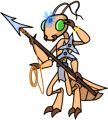
Thri-Kreen Ranger/Psionicist by me, based off of Rich's A Monster for Every Season
-
2017-08-20, 09:15 AM (ISO 8601)Ogre in the Playground
- Join Date
- Jul 2014
- Gender
Re: Please critique my new avatar!
Thanks!! Originally Posted by Lord Torath
Oh wow. Those wallpapers are beautiful. I'd only really paid any mind to the older ones (I prefer the older style), but the shadows make it come to life.
As for the thicker arms, no thank you I very much prefer the older style in regards to that. In fact, I think the only things I prefer in the newer style are the shadows and the transparency effects
Avatar by yours truly
Spoiler: Links & GitP Quotes Originally Posted by fyleisch
10 Commandments of Op./Practical Op. Originally Posted by Dark Shadow
3.5 WBL/GP
Cleric Domains
-
2017-08-20, 09:49 PM (ISO 8601)Orc in the Playground

- Join Date
- Jan 2014
Re: Please critique my new avatar!
I'll echo the comments other people have said in regards to the limbs. It took me a moment to "find" the leg lines and the arm that follows the railing line on the left.
One recommendation is that lines further into the background would benefit from some thinning, to help show that they're further away. It'd make the focus element (which I assume is the orc/half-orc?) feel bolder as well. As well as this, the position of the sun makes it weird to me that there's no dramatic shading on this side of the orc when there is such harsh shading on the background.
The rest of this is solid, though. It's good to see someone trying for armour that's a little more on-point. The scene in general reminds me of those chapters in adventure books where the main character quietly reflects on the story so far. You know, the bit where the main character broods at himself in a reflection before entreating Krom to help him kill his former-lover-turned-evil-emperor in the future, then turning away with a face of grim resolve for the road ahead? That's the feeling I got.
Maybe that's just me.Last edited by Shoreward; 2017-08-20 at 09:50 PM.

(Created by me. I should probably put that on there somewhere.)
-
2017-08-25, 04:18 PM (ISO 8601)Ettin in the Playground
- Join Date
- Aug 2011
- Location
- Sharangar's Revenge
- Gender
Re: Please critique my new avatar!
Another thing that might help is shifting the orc closer to the railing, so that the top rail is lower on his body, making the tops of his arms more visible. The more-visible tops of his arms will make the rest of his arms more easy to see as well.
Warhammer 40,000 Campaign Skirmish Game: Warpstrike
My Spelljammer stuff (including an orbit tracker), 2E AD&D spreadsheet, and Vault of the Drow maps are available in my Dropbox. Feel free to use or not use it as you see fit!
Thri-Kreen Ranger/Psionicist by me, based off of Rich's A Monster for Every Season
-
2017-08-26, 03:36 PM (ISO 8601)Pixie in the Playground

- Join Date
- Jul 2017
Re: Please critique my new avatar!
hey thats real cool! I dig it! I can't wait until i can customize my own avatar!

 Reply With Quote


 RSS Feeds: