Results 1 to 30 of 32
Thread: Potential T-shirt Design
-
2007-04-01, 11:48 PM (ISO 8601)Orc in the Playground


- Join Date
- Feb 2005
- Location
- Northern Virginia
 Potential T-shirt Design
We're appreciating the feedback in the Merchandise thread. Consensus seems to be forming around a "When life gives you crap" design and I will be working on that, and some other potential ones. But I had this design idea this weekend and I like it because it can be done in 3 colors on a black shirt. Dunno, what do you guys think of it?
 Rob Balder, Erfworld author/co-creator, and creator of PartiallyClips
-
2007-04-02, 03:23 AM (ISO 8601)Ettin in the Playground

- Join Date
- Feb 2007
Re: Potential T-shirt Design
*grins*
...I hadn't even thought of that. I like it. :)Cobra Avatar by the lovely Miss Nobody.
-
2007-04-02, 08:50 AM (ISO 8601)Magnificent Boop in the Playground
- Join Date
- Jul 2005
- Location
- Northern Virginia
- Gender

Re: Potential T-shirt Design
That looks neat.
-
2007-04-02, 11:20 AM (ISO 8601)Dwarf in the Playground
- Join Date
- Jan 2007
- Location
- on some forum, somewhere
- Gender
Re: Potential T-shirt Design
Oh my, now that does look good.
Exploding nuns, just what everyone needs...
Never were truer words spoken ThorFluff
-
2007-04-02, 11:38 AM (ISO 8601)Orc in the Playground
- Join Date
- Feb 2005
- Location
- Northern Virginia
Re: Potential T-shirt Design
Alternatives include ditching the phrase below it, or this simplified phrase which a couple of my friends said was too slogan-y:
 Rob Balder, Erfworld author/co-creator, and creator of PartiallyClips
-
2007-04-02, 11:42 AM (ISO 8601)Magnificent Boop in the Playground
- Join Date
- Jul 2005
- Location
- Northern Virginia
- Gender
Re: Potential T-shirt Design
I have a slight preference for the shorter version (for t-shirts, I would think that "slogan-y" is a good thing), but either one works. (I don't think it works as well if the tagline is deleted altogether.) Originally Posted by pclips

Last edited by SteveMB; 2007-04-02 at 05:49 PM. Reason: Additional Thought
-
2007-04-02, 07:58 PM (ISO 8601)Orc in the Playground

- Join Date
- Jan 2007
- Location
- A Little Basket.
- Gender
Re: Potential T-shirt Design
don't really like this as a t-shirt tbh, think it would look better as a poster ;) just my 2cp :)
-
2007-04-03, 12:43 AM (ISO 8601)Barbarian in the Playground
- Join Date
- Jan 2007
- Location
- The frozen wastes
- Gender
Re: Potential T-shirt Design
I like it, I think a version with and without the slogan would be nice.
And what about "It's the plot that counts"?Last edited by Erk; 2007-04-03 at 12:43 AM.
"River" cancels eat: Food is problematic.
-
2007-04-03, 01:28 AM (ISO 8601)Barbarian in the Playground

- Join Date
- Jan 2007
- Location
- Portland, Oregon
- Gender
Re: Potential T-shirt Design
Assuming that the smaller image shown against a shirt background is an indication of how it might look from a distance, it might be better to leave the slogan on the bottom solid. If you don't want the shorter slogan to overpower the title on top then you could make the letters the same size as the longer version and spaced out like the title.
At least, on my monitor, the slogan on the first shirt is clearly more legible than the slogan on the other.My avatar is a remix that I made of Prince Ansom. Resource credit:
Spoiler
Snag some Erfworld avatars and backgrounds, make some lolerfs and motivators (or demotivators), read my Erfworld fanmix, or check out my latest spotlight on an under-discussed webcomic: Head Trip (Scilight #13)!
-
2007-04-03, 04:18 AM (ISO 8601)Barbarian in the Playground

- Join Date
- Oct 2006
- Location
- Dublin, Ireland
- Gender

Re: Potential T-shirt Design
I like the new, shorter slogan better: it's catchier than the original. Love the design - it may not be clear to people who don't read the comic that the bright light is a teleportation - oops, moveamancy (move-'em-ancy?) - effect, but that does have the advantage of prompting conversations of explanation.
 "Courage is not simply one of the virtues, but the form of every virtue at the testing point."
~~~ C. S. LewisFirst Mate on board Hinjo's Junk
Theological Advisor of the Hinjo Fan Club
Shark Smiter of the O-Chul Fan Club
GitP Folding Team
-
2007-04-03, 10:40 AM (ISO 8601)Magnificent Boop in the Playground
- Join Date
- Jul 2005
- Location
- Northern Virginia
- Gender
Re: Potential T-shirt Design
That would lose the pun on "drags you in" (the scene shows Parson being literally "dragged in"). Originally Posted by Erk
I agree; the solid lettering would work better at a distance. Originally Posted by Scientivore
-
2007-04-03, 12:57 PM (ISO 8601)Pixie in the Playground
- Join Date
- Jan 2007
- Location
- G'burg, MD
- Gender
Re: Potential T-shirt Design
I love it!! The shorter slogan works better.
"It is always easier to believe than to deny. Our minds are naturally affirmative."
- John Burroughs
-
2007-04-03, 01:22 PM (ISO 8601)Pixie in the Playground

- Join Date
- Jan 2007
- Location
- CA
- Gender
Re: Potential T-shirt Design
I was actually thinking it should go the other way. Originally Posted by SteveMB
Shorten the slogan to " ... IT DRAGS YOU IN!"
The repitition of the word plot seems to slow it down to me.
-
2007-04-03, 03:26 PM (ISO 8601)Halfling in the Playground

- Join Date
- Dec 2005
- Gender
Re: Potential T-shirt Design
imo it would be best if there'd be no slogan, and the "erfworld" be written below the art. nice, plain and simple (i'm one of those "less is more"people).
if there needs to be a slogan, i must say Bounty has a good point.
either way, the concept is cool. the graphic suits shirting well."Suck my dirk."
-
2007-04-03, 04:32 PM (ISO 8601)Pixie in the Playground

- Join Date
- Feb 2007
- Location
- Massachusetts
- Gender
Re: Potential T-shirt Design
I liked it best with no slogan at all too. Or the " ... IT DRAGS YOU IN!", though I think I liked the idea of it just saying Erfworld underneath more then any of the phrases at all.
-
2007-04-03, 11:35 PM (ISO 8601)Ettin in the Playground
- Join Date
- Feb 2007
Re: Potential T-shirt Design
I think you've made a good point. Originally Posted by Bounty
Cobra Avatar by the lovely Miss Nobody.
-
2007-04-04, 01:04 AM (ISO 8601)Orc in the Playground

- Join Date
- Dec 2006
- Location
- Down Under
- Gender
Re: Potential T-shirt Design
Yeah, no need to repeat "Plot". IMHO.
 Roy Greenhilt Memorial Fan Club.
Life does not consist of level-appropriate encounters. Originally Posted by Balance
Avatar by the inimitable Ceika.
-
2007-04-04, 04:31 AM (ISO 8601)Pixie in the Playground

- Join Date
- Dec 2006
Re: Potential T-shirt Design
I agree on the "...it drags you in"
I would take another look at the image though, maybe with a professional screenprinter, to see if you could do some halftones, to soften those edges in the light blue/dark blue. Right now it kind of looks like it was done in MSpaint. And that is a shame for Jami's artwork.
-
2007-04-04, 05:35 AM (ISO 8601)Pixie in the Playground
- Join Date
- Apr 2007
Re: Potential T-shirt Design
I'd be interested if there were no text at the bottom. Originally Posted by pclips
-
2007-04-04, 11:48 PM (ISO 8601)Bugbear in the Playground
- Join Date
- Jul 2005
- Gender
Re: Potential T-shirt Design
You know, a t-shirt with just the "PLOT" on it would be pretty cool. However, the slogan completes it. Both say different things, but I like the first one better. Also fun would be Hamstard plus pizza stains.
Last edited by Thomar_of_Uointer; 2007-04-04 at 11:49 PM.
I make games.
"...I worry that modern gaming is gradually shrinking the wide spectrum of gameplay mechanics into a single narrow red bar with "KILL" written on it sideways. Exploration, navigation, puzzles, platforming, all gradually shrinking away until only one thing remains, being taken by the hand from room to room, moving on only when nothing remains alive in each one." - Yhatzee Crosshaw
-
2007-04-05, 02:12 AM (ISO 8601)Barbarian in the Playground
- Join Date
- Jan 2007
- Location
- Portland, Oregon
- Gender
Re: Potential T-shirt Design
I hope this doesn't seem presumptuous. I'm working on learning Photoshop Elements 5.0 right now and it seemed like good practice. I tried it with the ellipsis first and I didn't like the way it looked. It's in a spoiler tag because it's over 400 pixels wide.
It Drags You In!
Spoiler
Last edited by Scientivore; 2007-04-06 at 01:22 AM.
My avatar is a remix that I made of Prince Ansom. Resource credit:
Spoiler
Snag some Erfworld avatars and backgrounds, make some lolerfs and motivators (or demotivators), read my Erfworld fanmix, or check out my latest spotlight on an under-discussed webcomic: Head Trip (Scilight #13)!
-
2007-04-05, 06:44 PM (ISO 8601)Barbarian in the Playground
- Join Date
- Jan 2007
- Location
- The Stone of Farewell
- Gender
Re: Potential T-shirt Design
Ditto. The sound of it the way it is on the shirt now is just a little bit awkward. Originally Posted by Bounty
I will either find a way or make one.
We can evade reality, but we cannot evade the consequences of evading reality- Ayn Rand
Don't you know then, my son, how little wisdom rules the world?
___________________________________________
Thanks to Potatocubed for the potatavatar
-
2007-04-05, 08:10 PM (ISO 8601)Orc in the Playground
- Join Date
- Feb 2005
- Location
- Northern Virginia
Re: Potential T-shirt Design
Hm. Well then how about dropping the "It" and the excamation point too?
Rob Balder, Erfworld author/co-creator, and creator of PartiallyClips
-
2007-04-05, 08:42 PM (ISO 8601)Bugbear in the Playground
- Join Date
- Jul 2005
- Gender
Re: Potential T-shirt Design
But then it doesn't make sense to people that haven't read it... Originally Posted by pclips
Last edited by Thomar_of_Uointer; 2007-04-05 at 08:42 PM.
I make games.
"...I worry that modern gaming is gradually shrinking the wide spectrum of gameplay mechanics into a single narrow red bar with "KILL" written on it sideways. Exploration, navigation, puzzles, platforming, all gradually shrinking away until only one thing remains, being taken by the hand from room to room, moving on only when nothing remains alive in each one." - Yhatzee Crosshaw
-
2007-04-05, 08:47 PM (ISO 8601)Magnificent Boop in the Playground
- Join Date
- Jul 2005
- Location
- Northern Virginia
- Gender
Re: Potential T-shirt Design
How so? It reads either "ERFWORLD DRAGS YOU IN" or "ERFWORLD PLOT DRAGS YOU IN" (depending on whether or not it clicks in the reader's brain that the "PLOT" sound effect is actually a word in the T-shirt slogan) -- either one works as a statement in telegraphic/headline style English. Originally Posted by Thomar_of_Uointer
-
2007-04-05, 10:02 PM (ISO 8601)Barbarian in the Playground
- Join Date
- Jan 2007
- Location
- Portland, Oregon
- Gender
Re: Potential T-shirt Design
This really is good practice for me so I made a few more versions, without the exclamation point this time. Hope you don't mind! Originally Posted by pclips
It Drags You InSpoiler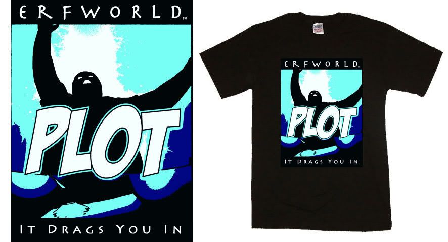
...Drags You InSpoiler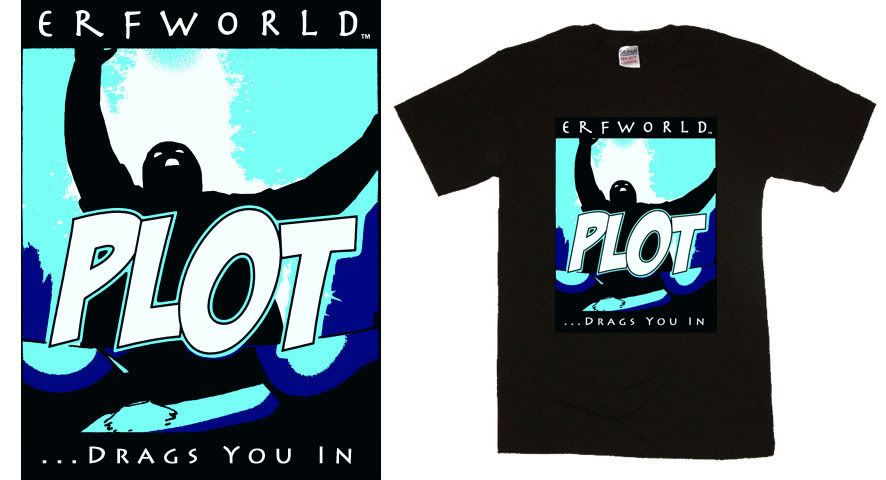
Drags You InSpoiler
Personally, I think that I like the last one the best.Last edited by Scientivore; 2007-04-06 at 01:23 AM.
My avatar is a remix that I made of Prince Ansom. Resource credit:
Spoiler
Snag some Erfworld avatars and backgrounds, make some lolerfs and motivators (or demotivators), read my Erfworld fanmix, or check out my latest spotlight on an under-discussed webcomic: Head Trip (Scilight #13)!
-
2007-04-05, 11:00 PM (ISO 8601)Orc in the Playground
- Join Date
- Feb 2005
- Location
- Northern Virginia
Re: Potential T-shirt Design
Yeah I have to agree. I like that last one.
Rob Balder, Erfworld author/co-creator, and creator of PartiallyClips
-
2007-04-06, 12:29 AM (ISO 8601)Dwarf in the Playground

- Join Date
- Nov 2006
- Location
- Annar
- Gender
Re: Potential T-shirt Design
I'd like it better if either there were no slogan at the bottom or if the slogan were an Erfworld pun....
What if it said "Make crap golems" at the bottom? It wouldn't make any sense to anyone who hasn't read the comic, but I kind of think that's the point with shirts like these....
-
2007-04-06, 01:33 AM (ISO 8601)Barbarian in the Playground
- Join Date
- Jan 2007
- Location
- Portland, Oregon
- Gender
Re: Potential T-shirt Design
Here's a sloganless version for you. Rebalancing it was more work than I was willing to do since I don't like it as much.
no sloganSpoiler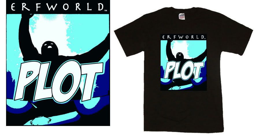
Also, sorry for making everyone load the other images again; with this one I had so many that I moved them all to a sub-album and renamed them.My avatar is a remix that I made of Prince Ansom. Resource credit:
Spoiler
Snag some Erfworld avatars and backgrounds, make some lolerfs and motivators (or demotivators), read my Erfworld fanmix, or check out my latest spotlight on an under-discussed webcomic: Head Trip (Scilight #13)!
-
2007-04-06, 02:34 AM (ISO 8601)Halfling in the Playground

- Join Date
- Dec 2006
- Location
- Portland, OR
- Gender
Re: Potential T-shirt Design
I personally don't like the last one. Without the punctuation, it reads very choppy. Nothing draws all three elements together. The elipses help because they tell the reader that the last line is a continuation of the earlier words (whether it's Erfworld or Plot, it doesnt really matter). It pulls all of it together. Originally Posted by Scientivore
The first one works nice too because while the lines stand alone and yet compliment each other by use of an actual pronoun instead of an implied pronoun. And personally, the first would be my choice of a design.


 RSS Feeds: