Results 1 to 11 of 11
-
2017-04-14, 12:10 PM (ISO 8601)Bugbear in the Playground


- Join Date
- Jun 2009
- Location
- Brazil
- Gender

 Vector graphics - help & feedback
So I'm trying my hand at graphic design, creating a logo to put in my games that I make with RPGMaker. It's a stylized lynx, from LynxCat (the name I publish under). Here's what I've got so far:
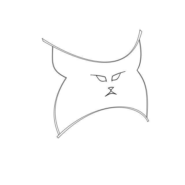
As you can see, the space between lines isn't filled, which is my biggest problem right now. I made it using the vectr.com website, but I can't get to fill it in there - when I set a "background" color for the curved shapes, it connects the two ends of each curve with a line and ends up with a "bowl" shape. I tried joining paths (e.g. the two curved shapes at the top as well as the straight lines that close them off at each end) into a group, but that doesn't make the editor understand that it's a single shape.
I tried downloading Inkscape, but when I open the svg file that I saved from vectr.com in it, it refuses to fill in those spaces because "they're not bounded", and when I try editing the paths to join them together, it doesn't seem to recognize path nodes at all.
Any help? I can provide the svg file for you to have a look if you'd like. I could always start over from scratch in Inkscape, but I'd like to avoid that if possible I've been using vectr.com because I've got the most time to work in it at work, but I can't install any programs there, anything I do has to be browser-based.
Also, what do you think of the logo itself? (Pretend the spaces between lines are filled to make it look like thick strokes.) Does it look nice, any suggestions to improve it?
Thanks in advance
The Heplion Contingency - Low-tech Cyberpunk with Psychic Powers!
D&D Creations / Homebrewing
The Haliburn Galaxy: D&D Reinvented as Science-Fiction
Book-Learnin' - Extended rules for the Knowledge skill
General Fiction
Wattpad Profile
Worldline Collapse
-
2017-04-14, 08:13 PM (ISO 8601)Bugbear in the Playground

- Join Date
- Feb 2012
- Location
- Earth
- Gender
Re: Vector graphics - help & feedback
Can't help you specifically with your website/program issues; I only use Adobe Illustrator, but I could make a guess.
I think your problem may be that you don't have a vector "shape", you have a series(12?) of long curved shapes that resemble lines. Hitting "fill" or "color" will fill the lines, but not the center of the image(his fur). You have to draw the four curved lines as one continuous line, and then fill that. Then draw each eye, nose, and mouth, and subtract those from the larger face shape using a pathway tool.
As far as composition goes, if it's a logo you want it to scale well. Look at this: and this:
Would your logo translate well if it was shrunk down to that size? Usually these things get put on letterhead, business cards, and now they serve as icons on your desktop, phone menu, and browser bookmark list. It has to look good small. I think the eyes, nose and mouth would get too blurry to tell what they were. Consider making them larger... and/or thicken the lines of the mouth, and exaggerate the corners of the eyes a bit more?
-
2017-04-14, 09:54 PM (ISO 8601)Bugbear in the Playground
- Join Date
- Jun 2009
- Location
- Brazil
- Gender
Re: Vector graphics - help & feedback
About scaling, I tried zooming out a fair bit, and yeah, I guess the facial features may be too small. Maybe I'd make them bigger and with bolder lines... and extending the lines at the corner of the eyes might be good too. Thanks for the suggestions. Originally Posted by Artman77

As for filling in, just to clarify, I don't intend to fill in the "fur". That part (as well as the inside of the eyes, nose and mouth) should stay transparent. You've probably noticed that most lines are sets of parallels, with a little segment at the end to close them off - that's what I want to fill in, the spaces between the parallels, to make each set of parallel curves look like a single, broader stroke.
And yes, each curve is a separate vector shape. The "sets" of parallels and closing segments at the ends are 4 paths each, not a single path, which is probably why I can't fill them in. My problem with Inkscape though is that it doesn't recognize the nodes at the ends of those paths, and therefore I can't join them into a single path. Maybe that's due to how Vectr exports the file. Eh, I think I'll end up just having to redo the whole thing from scratch.The Heplion Contingency - Low-tech Cyberpunk with Psychic Powers!
D&D Creations / Homebrewing
The Haliburn Galaxy: D&D Reinvented as Science-Fiction
Book-Learnin' - Extended rules for the Knowledge skill
General Fiction
Wattpad Profile
Worldline Collapse
-
2017-04-15, 08:02 AM (ISO 8601)Troll in the Playground

- Join Date
- Apr 2009
- Location
- ??Ph??
Re: Vector graphics - help & feedback
Honnestly your best bet seems to be retracing over the lines in inkscape, yes.And yes, each curve is a separate vector shape. The "sets" of parallels and closing segments at the ends are 4 paths each, not a single path, which is probably why I can't fill them in. My problem with Inkscape though is that it doesn't recognize the nodes at the ends of those paths, and therefore I can't join them into a single path.
Although have you tried 'convert objecct to path' on your selection first tho ? See if it recognize nods at hte tip after that ?Last edited by smuchmuch; 2017-04-15 at 08:04 AM.
I'm sig'ing in the rain, just sig'ing in the rain....
Somme old avatars, by meSpoiler
 -
-

-
2017-04-15, 08:36 AM (ISO 8601)Bugbear in the Playground
- Join Date
- Jun 2009
- Location
- Brazil
- Gender
Re: Vector graphics - help & feedback
Tried that, didn't help much. But I decided to start over from scratch on Inkscape (not even tracing it over, just starting from zero with the original in another window for reference), and it's a lot better. Inkscape is a lot easier to work with too, so work progresses much faster. And I found out the "fill" tool is the completely wrong tool for the job, I'm much better off using "fill and stroke" from the "object" menu Originally Posted by smuchmuch
The Heplion Contingency - Low-tech Cyberpunk with Psychic Powers!
D&D Creations / Homebrewing
The Haliburn Galaxy: D&D Reinvented as Science-Fiction
Book-Learnin' - Extended rules for the Knowledge skill
General Fiction
Wattpad Profile
Worldline Collapse
-
2017-04-15, 01:28 PM (ISO 8601)Bugbear in the Playground
- Join Date
- Jun 2009
- Location
- Brazil
- Gender
Re: Vector graphics - help & feedback
OK, redid the whole thing in Inkscape from scratch, with stronger facial features to help with scalability:

And here's a version at 20% size:

I'll still add text to the bottom, but I think the image itself looks fine... what do you think?Last edited by SirKazum; 2017-04-15 at 01:31 PM.
The Heplion Contingency - Low-tech Cyberpunk with Psychic Powers!
D&D Creations / Homebrewing
The Haliburn Galaxy: D&D Reinvented as Science-Fiction
Book-Learnin' - Extended rules for the Knowledge skill
General Fiction
Wattpad Profile
Worldline Collapse
-
2017-04-15, 11:16 PM (ISO 8601)Bugbear in the Playground
- Join Date
- Feb 2012
- Location
- Earth
- Gender
Re: Vector graphics - help & feedback
The equal distance between the top of the head and the eyes, and the bottom of the mouth and the chin are good for symmetry... but cats have a larger forehead. I would move the eyes down a little bit and maybe the mouth too to give it a larger forehead. It's a personal thing. Stylistically you can leave it as it is if you want. It works.
The only other thing I might change would be too movie lower right corner of his cheek out(to the right more) and up a little bit, for perspective. Other than that, it looks pretty good. Good work.Last edited by Artman77; 2017-04-15 at 11:17 PM.
-
2017-04-17, 09:13 AM (ISO 8601)Bugbear in the Playground
- Join Date
- Jun 2009
- Location
- Brazil
- Gender
Re: Vector graphics - help & feedback
I tried messing around a bit with the corner of the side-tuft, as well as with colors, but nothing looks that good (especially in small icons). So I'm settling on good ol' black-on-white. I just realized, though, that I hadn't posted the latest version here, with thicker lines for better visibility in small icons: Originally Posted by Artman77
Anyway, thanks a lot for the help and feedback! Now it's on to the text below it (finding a nice font and all), but I think the logo itself is settled.The Heplion Contingency - Low-tech Cyberpunk with Psychic Powers!
D&D Creations / Homebrewing
The Haliburn Galaxy: D&D Reinvented as Science-Fiction
Book-Learnin' - Extended rules for the Knowledge skill
General Fiction
Wattpad Profile
Worldline Collapse
-
2017-04-18, 06:11 PM (ISO 8601)Troll in the Playground

- Join Date
- May 2012
- Location
- California
- Gender
Re: Vector graphics - help & feedback
I'd personally make the lines thicker and bolder. It doesn't read very well unless you're close enough, and i think exaggerating your current lines a bunch would have a great look that reads much better. Just my two cents. I like the idea and design a lot, though.
Spoiler: Quote(s) Originally Posted by Temotei
Originally Posted by Kneenibble
Originally Posted by FinnLassie
"So whosoever is a hedgehog let him see to it that his wife is a hedgehog also, and so forth."
-
2017-04-19, 08:51 PM (ISO 8601)Bugbear in the Playground
- Join Date
- Jun 2009
- Location
- Brazil
- Gender
Re: Vector graphics - help & feedback
You know what, I felt that too. The smaller icons and such were hardly distinctive, they were a bit hard to make out. So here goes: Originally Posted by Cuthalion

I think this should be good enough for now... of course, if this gets serious enough I'd better hire an actual graphic designer, but I guess it'll do for the moment
The Heplion Contingency - Low-tech Cyberpunk with Psychic Powers!
D&D Creations / Homebrewing
The Haliburn Galaxy: D&D Reinvented as Science-Fiction
Book-Learnin' - Extended rules for the Knowledge skill
General Fiction
Wattpad Profile
Worldline Collapse
-
2017-04-27, 12:42 PM (ISO 8601)Titan in the Playground

- Join Date
- Aug 2007
- Location
- Imagination Land
- Gender
Re: Vector graphics - help & feedback
IMO, that looks MUCH better with the thicker lines.


 Reply With Quote


 RSS Feeds: