Results 901 to 930 of 1478
Thread: OotS Style Art/Fanart Showcase V
-
2013-07-21, 07:09 AM (ISO 8601)Titan in the Playground

- Join Date
- Mar 2009
- Location
- Sweden
- Gender

 Re: OotS Style Art/Fanart Showcase V
I like the mongoose, and there's really nothing that needs fixing about it.
Re: OotS Style Art/Fanart Showcase V
I like the mongoose, and there's really nothing that needs fixing about it. Originally Posted by SubLimePie

As I said when quoting Cuthalion (and didn't know where the horse was from, heh), I like the horse as well, but the front hooves would probably look good if pulled a little bit backwards (about half the wideness of the leg or so) so they're more below the legs rather than completely in front of them...
This one is really cool, and I must agree with Gulaghar, seeing you improve so quickly has been amazing. Originally Posted by SubLimePie

In fact, the only nitpick I can come up with at this time is that the crystal, due to what probably is an optical illusion, almost look like it's behind the chain. In order to counteract this, I suggest you either move the chain upward a bit to separate them two, or downwards to make it obvious that the crystal overlaps the chain, and not the other way around.
I like the fancy cart, even though it shines through that you've drawin it from a reference (on a reference?). The second cart, however, looks a bit more barebone, even though you succeeded at making the canvas look good. If you intend to use it, well, put it behind some horses, and fill it up with some objects to make it seem more "alive". Originally Posted by SubLimePie
Yeah, but there's a difference between a high level of detail and sheer crowdiness. Also, the level of detail has to be balanced across the work, or at least be focused on those parts you want to catch the beholder's eye. Originally Posted by Eldan
To take your second version of the lilith compared to the first, you've made her wings at least twice the priginal size and increase their level of detail quite tremendously while doing next to nothing to her body. This means that my first thought every time I look at it was and will be "Wings.", which is sad, because, to be honest, the part about here I think you've succeeded the best with is the top part of her tail, not her wings.
Well, vector graphics was never intended to be drawn with a pencil to start with (this computer of mine has a tablet screen with a pen, yet I use the mousepad while working in Inkscape), I just sketch because it's quicker for me to convey an idea that way. Here's a (sort of) step-by-step walkthrough of how I took the sketchover I did and transfered it to Inkscape: Originally Posted by Eldan
Spoiler
- Firstly, use the Bezier curve drawing tool to put nodes on all the corners (and at regular intervals along the curves, but I wanted to keep it quick and simple for now).
- Secondly, curve the lines using the path editing tool.
- Thirdly, give it all a colour that makes sense.
- And finally, do some post-processing to make it look more complete and thought through.
Note that if I did this from scratch, I wouldn't have used any sketch to start with, but may instead have done something like this:

- Firstly, draw a shape roughly matching the outline you want your wings to have.
- Secondly, draw V-shapes for every feather.
- Thirdly, curve the sides of the V-shapes so that they look like actual feathers.
- Fourthly, fill them in with the desired colour. Here, I decide that a second row of feathers will be neccessary.
- Fifthly, draw the second row using the same technique as above.
- Sixthly, draw the top of the wings. This time, I went for a thick, burry look, so I drew it as it's own element rather than just as an extension of the top row of featers. Also, here I did some post-processing to give the feathers more even spacings, lengths and sharpnesses.
- Finally, remover the helper outlines.
Now, if this wing was to be used for something, I'd have put more effort behind reducing the amount of empty space between the tips of the feathers and figured out a way to reduce the amount of line clutter as well, but you get the idea. Also, since there are about as many ways of drawing wings as there are artists, I'm not saying that this is how you should draw wings, but rather showing how you can use the strengths of vector graphics to your advantage.Clouddreamer Teddy by me, high above the world, far beyond its matters...
Spoiler: Banner by Vrythas
-
2013-07-22, 01:08 PM (ISO 8601)Ogre in the Playground
- Join Date
- Sep 2011
- Location
- writhing about
- Gender
Re: OotS Style Art/Fanart Showcase V
The George Hearn style Sweeney Todd. (Not the Depp version, because bleh. Hatter no likey bad movie versions of great operas.)
Spoiler

-
2013-07-22, 02:12 PM (ISO 8601)Colossus in the Playground

- Join Date
- Jan 2007
- Location
- Switzerland
- Gender
Re: OotS Style Art/Fanart Showcase V
Quick and dirty Drider because someone wanted one for a miniature:
Spoiler
I'll probably go back and add some detail to the clothing and the Abdomen. And the weapon.
Really, I'm loving Inkscape. Wonderful program.Resident Vancian Apologist
-
2013-07-22, 03:01 PM (ISO 8601)Titan in the Playground
- Join Date
- Mar 2009
- Location
- Sweden
- Gender
Re: OotS Style Art/Fanart Showcase V
@Hatter:
I'm not going to respond to your image, because I'm kind of creeped out by it, but if you get the chance, try and save your works as .png rather than .jpg (or .jpeg), because .jpg is lossy and creates ugly artifacts during the compression...
You managed some pretty good legs, I'd say, even though she seems to have lost one... Originally Posted by Eldan
However, her torso doesn't quite line up with her legs, as right now, she'll have to rotate her spine almost 90° between the top leg and her chest...
Also, her hair could use some more love. Drawing hair is one of the trickiest parts, which is why you as a beginner should put lots of effort to learn how to make it good without having to spend too much time on it. Especially her hairline may be a bit too high.
And finally, her grip on the weapon is a bit awkward, with her right hand behind it like that...
Agreed. Vector graphics have a certain appeal to them, even though it doesn't work as well for non-cartoony images... Originally Posted by Eldan
Last edited by Teddy; 2013-07-22 at 03:04 PM.
Clouddreamer Teddy by me, high above the world, far beyond its matters...
Spoiler: Banner by Vrythas
-
2013-07-22, 03:23 PM (ISO 8601)Colossus in the Playground
- Join Date
- Jan 2007
- Location
- Switzerland
- Gender
Re: OotS Style Art/Fanart Showcase V
Urk, yeah. I'm only seeing it just now. Those legs are in the wrong place.
And hair is really, really hard.
Does this pose look spine-friendlier? I'm not sure and it still looks wrong.
Spoiler

Last edited by Eldan; 2013-07-22 at 03:38 PM.
Resident Vancian Apologist
-
2013-07-22, 05:18 PM (ISO 8601)Titan in the Playground
- Join Date
- Mar 2009
- Location
- Sweden
- Gender
Re: OotS Style Art/Fanart Showcase V
Now it's a little bit too much to her right instead. Try somewhere inbetween those two. I mean, if you draw a line between between her breasts going straight down, then move it somewhere between 5 and 10 pixels to your left, it should go between where the top row of legs should sprout from. Originally Posted by Eldan
Clouddreamer Teddy by me, high above the world, far beyond its matters...
Spoiler: Banner by Vrythas
-
2013-07-22, 09:31 PM (ISO 8601)Ogre in the Playground
- Join Date
- Jul 2012
- Location
- Lost in my imagination
Re: OotS Style Art/Fanart Showcase V
*Comes back after several days. Sees posts calling me rude. Sighs, posts picture.*

-
2013-07-23, 01:43 AM (ISO 8601)Bugbear in the Playground
- Join Date
- Jun 2010
- Location
- Not in a secret base, no!
Re: OotS Style Art/Fanart Showcase V
Here is something I made recently about one of my favorit League of Legends Chars.
 Grammer is my declared deadly enemy!
Avatar by Ceika
Let's PLay's in German Take a Look at Bravely Default.
Nexus Characters: LINK
-
2013-07-23, 01:38 PM (ISO 8601)Troll in the Playground

- Join Date
- May 2012
- Location
- California
- Gender
Re: OotS Style Art/Fanart Showcase V
And here is a merman, sorta. Quite simple.
 Spoiler: Quote(s) Originally Posted by Temotei
Originally Posted by Kneenibble
Originally Posted by FinnLassie
Spoiler: Quote(s) Originally Posted by Temotei
Originally Posted by Kneenibble
Originally Posted by FinnLassie
"So whosoever is a hedgehog let him see to it that his wife is a hedgehog also, and so forth."
-
2013-07-23, 04:46 PM (ISO 8601)Ogre in the Playground

- Join Date
- Mar 2011
- Location
- My Campaign Setting
- Gender
Re: OotS Style Art/Fanart Showcase V
One of my good friends has been pestering me to draw up his character, and today I cracked and decided to make it for him.
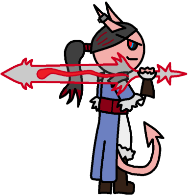
Seems he's annoyed, too. ~The meteorite is the source of the light, and the meteor's just what we see,
and the meteoroid is a stone that's devoid of the fire that propelled it to thee.
And the meteorite's just what causes the light, and the meteor's how it's perceived,
and the meteoroid's a bone thrown from the void that lies quiet in offering to thee.~
Tatzlwyrm Avatar by me.
Extended Sig thisaways.
-
2013-07-23, 06:58 PM (ISO 8601)Titan in the Playground
- Join Date
- Mar 2009
- Location
- Sweden
- Gender
Re: OotS Style Art/Fanart Showcase V
Whew, and here I was afraid you'd been scared off, which would be sad, because I like your pictures... Originally Posted by asdflove
There are things going on, and I like that, and I like their hair as well, even though his hair is kind of obvious that you've used the same element twice, only flipped over... Originally Posted by asdflove
Now, the orange cloak seems... misfitting, as if you've accidently moved it a few pixels too far to her right, because you can see the cloak, not just the collar, to her right, and the fold to her left disappears in beyond her back...
Also, they hold their swords a bit awkwardly. Right now, it looks like they're folding their whole hands around the hilt, and not just their fingers. Try to just draw 3 separate lines coming up from behind and make up your idea of what you like the most.
And speaking of the swords, they don't really seem to meat in a way which would make them klink against eachother, especially since he is fighting left-handed. Try bringing his sword to the front and pointing it more toward the viewer so that it looks like he's parrying her blow (he seems to be the most likely to do the parrying, judging from their conversation).
Furthermore, his speech bubble is a bit too long. Try breaking out the last sentence to its own bubble, and possibly the first one as well, and it'll look less blocky and "how does he have time to say all this in battle"-y...
The elf woman's ears are perhaps a bit too thin and lack curved lines. Also, she almost seems like she's (okay, perhaps not-so-)casually walking straight into the scene rather than shunning away from the armed woman who wants to kill her, which at least is what I would do in such a situation...
And finally, I think the women's shoes are a bit too flat and pointy, but it seems you've already made an artistic choice on that matter, so I'll leave it up to you.
Nice! The small size doesn't do it much justice, though, but I assume it's intended for a possible future avatar, yes? Originally Posted by Zefir
Also, I understand you want to give the idea of a lot of those turquoise crystals, but it becomes so crowded they become hard to make out from the mass, so it almost defeats its own purpose. Have you tried drawing fewer, shorter crystals in front and then filling up with longer crystals behind to give a sense of numbers?
I like it! Originally Posted by Cuthalion
That said, the shield could use some love. Is it intended to look like a snail shell, or just decorated with a spiral pattern? Have you considered perhaps making the shield more aquatic-themed, like the shell of a giant oyster or scallop, or a turtle, or perhaps covered in a fishnet? I could go on forever...
Also, his grip around the trident is a bit weird. He should probably best hold his hand behind it, not in front of it...
Nice in overall, even if that eye seriously creeps me out and clashes a bit with the rest... Originally Posted by Kymme
Now, at the left (our left) barb of his tail, there's a sudden dent in the tail, which looks a bit awkward.
Also, his upper arm should probably protrude from the middle of the coat arm, not the top, as the coat arm is assumed to fit at least mostly snugly around the arm...Clouddreamer Teddy by me, high above the world, far beyond its matters...
Spoiler: Banner by Vrythas
-
2013-07-23, 07:14 PM (ISO 8601)Ogre in the Playground

- Join Date
- Oct 2008
- Location
- Wellington, New Zealand
- Gender
Re: OotS Style Art/Fanart Showcase V
All of Asdflove's battle scenes remind me that I haven't drawn one in a while. I suppose that gives me something to do...
-
2013-07-23, 07:22 PM (ISO 8601)Ogre in the Playground
- Join Date
- Jul 2012
- Location
- Lost in my imagination
Re: OotS Style Art/Fanart Showcase V

Thats intentional about his hair. Its how I wanted it to look. Originally Posted by Teddy
Oops. Yeah, that was just an error, and I didn't even notice it. Originally Posted by Teddy
... I've been doing it like that for a while, since I thought it looked silly to have hand just sitting behind the weapon like rich usually does, but for some reason I never considered just drawing their fingers around it instead of just placing their hands. Originally Posted by Teddy
Oh. (He's left handed, so he's going to fight left handed.) He is parrying the blow, since he was trying to block her. I'll do that. Originally Posted by Teddy
Oh. I drew this entire thing without my mouse, so I was cutting corners a bit while I was finishing it. Originally Posted by Teddy
It's not much of a battle and more of a tense stand-off.
They're supposed to be mostly covered by her hair, actually. Thats supposed to be the ends of her ears, but I see what you mean. Originally Posted by Teddy
Tiff is half about to run away, half help fight Lila even though she's lacking her rapier. Of course she's not totally helpless without a weapon. She's a succubus after all.
Yeah. I like how her shoes are... Originally Posted by Teddy
Last edited by asdflove; 2013-07-23 at 08:05 PM.
-
2013-07-23, 07:49 PM (ISO 8601)Ogre in the Playground
- Join Date
- Mar 2011
- Location
- My Campaign Setting
- Gender
Re: OotS Style Art/Fanart Showcase V
Probably should have mentioned that he is a Tiefling Soulknife. Originally Posted by Teddy
Heh. You and me both. I think that's the desired effect. Originally Posted by Teddy
I see dat bump. I'm going to round it out, and post back. Originally Posted by Teddy
Actually, the sleeve is supposed to be baggy and hang of the arm. That might not be easily intuitive, though. Originally Posted by Teddy
Thank you for the critique, once again!
~The meteorite is the source of the light, and the meteor's just what we see,
and the meteoroid is a stone that's devoid of the fire that propelled it to thee.
And the meteorite's just what causes the light, and the meteor's how it's perceived,
and the meteoroid's a bone thrown from the void that lies quiet in offering to thee.~
Tatzlwyrm Avatar by me.
Extended Sig thisaways.
-
2013-07-23, 09:12 PM (ISO 8601)Ogre in the Playground
- Join Date
- Oct 2008
- Location
- Wellington, New Zealand
- Gender
Re: OotS Style Art/Fanart Showcase V
I'm a little out of practice with these sorts of things.

Last edited by Darklord Bright; 2013-07-23 at 09:12 PM.
-
2013-07-24, 04:10 AM (ISO 8601)Bugbear in the Playground
- Join Date
- Jun 2010
- Location
- Not in a secret base, no!
Re: OotS Style Art/Fanart Showcase V
It is an atemp for a new avatar, yes. Originally Posted by Teddy
Actually the crystals aren't many small onece. I drew one big outline and then added lines between to give the impression of a lot. I will post a larger version when I come home.Grammer is my declared deadly enemy!
Avatar by Ceika
Let's PLay's in German Take a Look at Bravely Default.
Nexus Characters: LINK
-
2013-07-24, 02:27 PM (ISO 8601)Halfling in the Playground
- Join Date
- Jul 2013
- Location
- Canada
- Gender

Re: OotS Style Art/Fanart Showcase V
Hey everyone, I've been working on a webcomic recently
and I'm wondering if you guys could throw some critiques at it here :)?
I like your merman, Cuthalion, especially the swirls on his shield that give it an Aegean accent.
Spoiler: because large signatures are annoying(Dorm)ant until summer~

-
2013-07-24, 02:29 PM (ISO 8601)Troll in the Playground
- Join Date
- May 2012
- Location
- California
- Gender
Re: OotS Style Art/Fanart Showcase V
In the second comic, last panel, the logs blend in with the rest of the pit, and it looks like you just scribbled them in and didn't shade. I like the coach.
Spoiler: Quote(s) Originally Posted by Temotei
Originally Posted by Kneenibble
Originally Posted by FinnLassie
"So whosoever is a hedgehog let him see to it that his wife is a hedgehog also, and so forth."
-
2013-07-24, 03:18 PM (ISO 8601)Troll in the Playground
- Join Date
- Jul 2009
- Location
- Garreg Mach Monastery
- Gender
Re: OotS Style Art/Fanart Showcase V
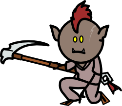
A half-orc, half-ogre monk, which I may or may not end up playing in a Pathfinder game. She uses a sharrash, some kind of fancy scythe made by dinosaur-riding halflings.Last edited by Derjuin; 2013-07-24 at 03:19 PM.
-
2013-07-24, 03:42 PM (ISO 8601)Bugbear in the Playground
- Join Date
- Jun 2010
- Location
- Not in a secret base, no!
Re: OotS Style Art/Fanart Showcase V

Here is the promised bigger Version.Grammer is my declared deadly enemy!
Avatar by Ceika
Let's PLay's in German Take a Look at Bravely Default.
Nexus Characters: LINK
-
2013-07-24, 04:26 PM (ISO 8601)Titan in the Playground
- Join Date
- Mar 2009
- Location
- Sweden
- Gender
Re: OotS Style Art/Fanart Showcase V
Nice! Do you have somewhere where the story behind your images is drawn up. I probably won't have time to read it through, but it would be nice to know, because your images are pretty story-intensive? Originally Posted by asdflove
Only a few minor things to point out here:
The red-headed man's rapier seems to lack a hilt guard, and it blends a bit too much together with the red-headed woman's arm (at first, I thought they were holding hands until I took a closer look).
The way the lying black-haired woman holds her arm across her face kind of breaks up her features. I understand you're trying to show her holding her forehead, but the blackness of her hair makes it hard to see...
The blue-clad woman's bow is either terribly small, or, if tilted, held in an awkward way. Although I assume the size may be intentional...
And finally, try to rotate some of the injury #s, because the uniformness makes them almost look copied and pasted all over, despite evidence to the contrary...
Then it isn't a problem. Originally Posted by asdflove
That's what I'm here for, isn't it. Originally Posted by asdflove

Yeah, it's a legit reason... Originally Posted by asdflove
Hmm, yeah, I agree, it's hard to make someone look both eager and hesistant. You could try imagining how to do such a pose yourself and then draw it, but I lack any better advice than that, at the moment... Originally Posted by asdflove
Try making it a more V-shaped at the other side form the arm to give the idea that it doesn't round itself around anything... Originally Posted by Kymme
No worries, I love doing this when I see it pay off. Originally Posted by Kymme
Hmm, lots of movement, and I like that. Originally Posted by Darklord Bright
That said, I think he's defending a bit too high up to parry her blow. Try either moving the magic disk (with hands and all) downwards, or moving all of him downwards instead. I'd probably do the latter, it gives a strong idea of her having the upper hand, at least aggression-wise...
Also, her right hand seems to move like she's trying to knock him with the bottom of her gauntlet, rather than impale him on the spikes. Try rotating it 90° so that her palm (if it wasn't clenched) is turned toward the viewer, and perhaps even point her hand toward the screen (so it doesn't look like she's trying some "artillery blow").
Yeah, my point is that perhaps there are a bit too many of those inbetween lines, making it a clutter. I suggest trying fewer lines and more perspective, but it's your call. Originally Posted by Zefir
EDIT:
*sees larger image*
Yeah, I stand by my postion about the crystals on his arms being cluttery, and the details on the top crystals blur out and don't work especially well at avatar size, even though they're pretty cool now.
High quality all the way around, it's almost sad that there's next to nothing for me to comment about, since that means I won't get to study it as closely. Originally Posted by Derjuin
However, the square loop at the end of her sharrash looks a bit neglected, with one side being much thinner than the others (I assume it's intended to be square shaped, yes?)...Last edited by Teddy; 2013-07-24 at 04:37 PM.
Clouddreamer Teddy by me, high above the world, far beyond its matters...
Spoiler: Banner by Vrythas
-
2013-07-24, 06:43 PM (ISO 8601)Ogre in the Playground
- Join Date
- Jul 2012
- Location
- Lost in my imagination
Re: OotS Style Art/Fanart Showcase V
There are several different stories my pictures go to. Two of them are my fancomics, which can be accessed through the linked pictures under the spoilers in my signature. Originally Posted by Teddy
The other, that my most recent picture is from hasn't been written yet. I want to make a fancomic of it too, but since I already have two, I'm waiting on it.
He isn't holding a rapier. I think you're mistaking the line of her cloak... Originally Posted by Teddy

She actually has dark brown hair, but that's being overly technical. I can see what you mean, but I don't really know what else I could do there... Originally Posted by Teddy
Henia uses a short bow, therefore yes, the size is intentional. Originally Posted by Teddy
Will do. Originally Posted by Teddy
-
2013-07-24, 07:03 PM (ISO 8601)Ogre in the Playground
- Join Date
- Sep 2009
- Location
- Beyond the Wall
- Gender
Re: OotS Style Art/Fanart Showcase V
Phew, haven't posted here in a bit. In regards to the advice people gave me earlier: thank you very much, I'll be sure to keep all that in mind for future pictures. I won't be editing that particular one further, but the advice is appreciated none the less.
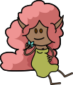
And now I have my latest work, featuring (left to right) Irena and Nadia after their wedding.

-
2013-07-24, 07:49 PM (ISO 8601)Titan in the Playground

- Join Date
- Apr 2012
- Gender

Re: OotS Style Art/Fanart Showcase V
Oh, a most intense kiss! Where were they wed? Originally Posted by Gulaghar
-
2013-07-25, 01:59 AM (ISO 8601)Bugbear in the Playground

- Join Date
- Feb 2013
- Location
- Missouri, USA.
- Gender
Re: OotS Style Art/Fanart Showcase V
I like the scar, pose, and weapon. The outfit and color scheme work great as well Originally Posted by Derjuin
I'm curious about something though: is it a half-orc with the half-ogre template, an ogrillon, an orog, is there a race in pathfinder that has this mixed-blood, or... Well, you get the idea. How did she come about and what's the specific name for her race if she has one?
And since I'm already here, here's a group of illithorcs (again, this is a big picture):
Spoiler
I realize the bodies are to thick and the armor should be a bit away from the edge of the body, but I'd forgotten to do that before all the screen shots were taken and pieced together and I haven't had time to correct these problems. In addition to that, the sitting monk will get boots added to him and I'll likely throw in a couple more classes.
Any suggestions/critigues and such?Last edited by gurgleflep; 2013-07-25 at 02:23 AM.
-
2013-07-25, 09:13 AM (ISO 8601)Ogre in the Playground
- Join Date
- Sep 2007
- Location
- Mexico
- Gender
Re: OotS Style Art/Fanart Showcase V
Well, the bard Illithorc could do with having his feet straight. It looks like he's floating (though maybe that what you were going for). Originally Posted by gurgleflep
The bodies of all of them could do with being a bit thinner (just a small reduction, they're looking really good now.)
Other than that, it's a solid work.Last edited by Crimmy; 2013-07-25 at 09:13 AM.
Last edited by Crimmy : Tomorrow at 26:72 DM.
__________________________________________________
Unavailable via PM. Please check this thread to find avatarists.
Avatars
Crimms: Seer of Space
Spoiler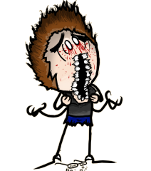
Iron Avatarist has gone on hiatus. Give me your feedback, please
Spoiler
-
2013-07-25, 01:08 PM (ISO 8601)Ogre in the Playground
- Join Date
- Sep 2009
- Location
- Beyond the Wall
- Gender
Re: OotS Style Art/Fanart Showcase V
Well, these two are characters a friend and I play over on the Free Form Roleplaying section of the boards in the Nexus setting. The wedding scene is still actually ongoing, just started in fact. I jumped the gun because I really wanted to draw this picture, though. Originally Posted by TaiLiu
 I may not actually know where they're going to have the actual ceremony. <.< >.>
-
2013-07-25, 01:19 PM (ISO 8601)Ogre in the Playground
- Join Date
- Sep 2012
- Location
- Definitely lost
- Gender
Re: OotS Style Art/Fanart Showcase V
Well, at least you probably got the awesome fedora right. As long as everyone's hats are in order location isn't terribly important
Spako Highclaws by Ceika.
[Sorry Boss, but as always, I get the last word.]
-
2013-07-25, 01:35 PM (ISO 8601)Titan in the Playground
- Join Date
- Mar 2009
- Location
- Sweden
- Gender
Re: OotS Style Art/Fanart Showcase V
Ahh. I should check out people's signatures more often. Perhaps I'll check it out later sometime... Originally Posted by asdflove
Ahh, now I see. The cloak is so similar to her hair that they sort-of faded together when I didn't think about them. Now, if you didn't intend for them to hold eachother's hands, I think it may be a good idea to move at least his hand a little in either direction to put some distance between them... Originally Posted by asdflove
Well, apart from changing her pose, not much really... Originally Posted by asdflove
Also, expect me to use inadequate physical descriptions and forget names I've already been told. I've got a lot to keep in mind, so I have to cut down on something...
Perhaps it's a little too short for a shortbow, but it gets the idea across, I'll give you that. Originally Posted by asdflove
You're welcome! Originally Posted by Gulaghar
Pretty, lovely! I especially like how, uh, whoever the woman in the white dress is burrows her hand in the other's hair. Originally Posted by Gulaghar
Just a minor point of notice, when I first looked at the blonde woman's ear, my first thought was "that's a very strange ear" until I realised that what I thought was an extension of it actually was a gap between a curl and the hair going behind her ear. If you wish to counteract this, I suggest you try and curve the hair going behind her ear a bit more upwards so it looks like it's curving iself around the top of where the ear is attached to the head.
They're good, and I'm getting a better feel for them every time you put up a new picture. Originally Posted by gurgleflep
That said, try and make it so that the tentacles to the sides visibly overlaps the mouths, because right now it almost looks like their mouths cut into the tentacles...
Also, the yellow monk's (presumable) index fingers look a bit disconnected from the rest of the hand as you can see their line ends...
The barbarian is holding his axe a bit weirdly. Unless I'm incorrect, you should hold a battleaxe as far down the pole as reasonable for maximum leverage. Also, try to give his right arm a bit more prominent elbow to give the idea that he's folded it, thereby giving more motion to the pose.
And finally, while I agree with Crimmy, you may also try to curve his left knee a bit to give him more of a pose...Clouddreamer Teddy by me, high above the world, far beyond its matters...
Spoiler: Banner by Vrythas
-
2013-07-25, 02:02 PM (ISO 8601)Ogre in the Playground
- Join Date
- Sep 2009
- Location
- Beyond the Wall
- Gender
Re: OotS Style Art/Fanart Showcase V
Of course! Fancy hats are clearly what's important! *nodnod* Originally Posted by LordDeathkeeper
Nadia has the red hair and Irena the blond. Originally Posted by Teddy
And yeah, I definitely see what you mean about the ear. That was actually bugging me before, but I think I lost track of it int he rest of the picture.
Spoiler
I think this is better.

 Reply With Quote


 RSS Feeds: