Results 181 to 210 of 1472
-
2019-06-06, 04:49 AM (ISO 8601)Titan in the Playground


- Join Date
- Jan 2008
 Re: Warhammer 40K Tabletop Thread XXXVII: Highlighting the Contrasts
Woah woah woah.
Re: Warhammer 40K Tabletop Thread XXXVII: Highlighting the Contrasts
Woah woah woah. Originally Posted by Wraith

That was my point. I think you're being defensive about something we agree with each other on. Hopefully this'll clear it up.
My point wasn't to call you out.
The reason I used your post is because I had anecdotal evidence on this very forum to back myself up.
My point was that you get to decide which criticisms about your models, from someone else, matters.
- I'm ignoring the part about the yellow paint job.
- I'm ignoring the part about the pink and white wings.
Those are what I want. Those bits are what I like. If you have a problem with my models, tough ****.
I choose what matters, to me. Why would I care about someone complaining about the parts of the model I actually want/like?
The mold line? I didn't intend. I don't want. And it's really obvious. My model would be better - objectively - if it didn't have a huge mold line on it. I agree. The truth hurts.
Requizen, same model, said that it would be better if there was more contrast in the wings. You know what? As a detail-orientated guy myself...He's right! I took that criticism on board and reshaded the wings a bit more.
These are criticisms I took on board because it highlights aspects of the model I don't want...Even if I didn't notice the bit about the wings until after it was pointed out to me.
Another guy in my meta, was really happy with his Nurgle Predator, until someone pointed out...
"Uhh...You know the barrel looks like a giant ****?"
Oops. It was not the converter's intent to make a ****-mobile. Scrap the barrel, start again.
Contrastingly, my Deathwatch Guilliman. I, didn't like it. It felt too much Black Legion, not enough Deathwatch. Essentially, the model was too dark. Given that I paint yellow models, maybe my bar is too high? But not the point.
A lot of people, when I showed them the problem, didn't understand what I was talking about. The model looks great! Nice minor conversion. If it looks good, there's no problem? ...Uhh...No.
Missing the point. I need to know how to fix this problem I have. I, me, am not happy with it. It's not what I want...Even if it looks good to other people.
So I brightened him up. Some people didn't even notice the difference. I did. Because it's my model.
Listen to Wraith. He's a cool guy.Although one thing I would like to suggest, possibly for the benefit of everyone in the current discussion, is the difference between an opinion being invalid and it just being irrelevant.Last edited by Cheesegear; 2019-06-06 at 04:53 AM.
Spoiler: My Mum Says I'm Cool Originally Posted by Anuan
Originally Posted by Lycan 01
Originally Posted by MeatShield#236
Originally Posted by Shas'aia Toriia
-
2019-06-06, 04:53 AM (ISO 8601)Firbolg in the Playground

- Join Date
- Apr 2007
- Location
- England
- Gender

Re: Warhammer 40K Tabletop Thread XXXVII: Highlighting the Contrasts
I assure you, it's faux outrage for comedic (?) effect. We're cool. Originally Posted by Cheesegear
 ~ CAUTION: May Contain Weasels ~
RPG Characters What I Done Played As (Explained Badly)
17 Things I Learned About 40k By Playing Dark Heresy
Tales of a Role-Play Gamer - Horrible Optimisation
-
2019-06-06, 01:10 PM (ISO 8601)Banned

- Join Date
- Jun 2010
- Location
- Lima, Peru
- Gender
Re: Warhammer 40K Tabletop Thread XXXVII: Highlighting the Contrasts
Like thats a thing? I could show such great models and busts done with exactly that. Sure, I couldnt paint that well if you gave me a full Citadel rack, but being poor doesnt mean being bad at things. You just need to get more creative. WAY more creative, sometimes. Wet palletes and color mixing have been a thing, so as long as you have the right 6 paints and 1 wash you can do almost anything. Originally Posted by Cheesegear
On the matter of criticism, I dont think anyone is harsh on purpose. I do think some people are just way too sensitive, but its a given if you expect people to put care and love into what they do. Cant have one without the other; but rubbing against each other is the only way to smooth out differences (not literally, unless thats your thing).
For our little community for example, everyone tends to prop up those who try. We love when our peers get better, because then we have to step up our own game, so its motivating. Newbies are to be embraced and lovingly cared for. But people who think they are big shots and fail get mocked into the dirt. All in good spirits though, its just to show nobody is untouchable and even 'pros' screw up from time to time.
-
2019-06-06, 01:45 PM (ISO 8601)Ettin in the Playground
- Join Date
- Apr 2007
- Location
- Lemuria
- Gender
Re: Warhammer 40K Tabletop Thread XXXVII: Highlighting the Contrasts
Or just don't play those scenarios. Shocking idea I know... But we literally decided objectives were stupid in literally our first game playing with them and happily have gone on playing out tiny wargames ever since. Originally Posted by Cheesegear
Objectives are lazy nonsense distractions from the actual game.Last edited by druid91; 2019-06-06 at 01:45 PM.
Spoiler Originally Posted by AvatarZero
Non est salvatori salvator, neque defensori dominus, nec pater nec mater, nihil supernum.
Torumekian knight Avatar by Licoot.
Note to self: Never get involved in an ethics thread again...Especially if I'm defending the empire.
-
2019-06-06, 08:26 PM (ISO 8601)Titan in the Playground
- Join Date
- Jan 2008
Re: Warhammer 40K Tabletop Thread XXXVII: Highlighting the Contrasts
So what is the actual game? 'Let's just kill each other'? Originally Posted by druid91
In which case Mathhammer becomes King. Just like it did pre-5th Ed.
Which leads directly to an arms race in your meta around one or two Codecies because every other Codex doesn't have certain units.
The fact that you need Troops (the majority of the time), is currently what's keeping the game balanced at all.Spoiler: My Mum Says I'm Cool Originally Posted by Anuan
Originally Posted by Lycan 01
Originally Posted by MeatShield#236
Originally Posted by Shas'aia Toriia
-
2019-06-06, 08:56 PM (ISO 8601)Titan in the Playground
- Join Date
- Feb 2008
- Location
- Canada
- Gender
Re: Warhammer 40K Tabletop Thread XXXVII: Highlighting the Contrasts
So do you just do kill points or do you come up with your own scenarios? Originally Posted by druid91
Spoiler: I'm a writer!Spoiler: Check out my fanfiction[URL="https://www.fanfiction.net/u/7493788/Forum-Explorer"here[/URL]
]Fate Stay Nano: Fate Stay Night x Magical Girl Lyrical Nanoha
I Fell in Love with a Storm: MLP
Procrastination: MLP
Spoiler: Original FictionThe Lost Dragon: A story about a priest who finds a baby dragon in his church and decides to protect them.
-
2019-06-07, 02:54 AM (ISO 8601)Bugbear in the Playground

- Join Date
- Mar 2007
- Location
- Durham, UK
- Gender
Re: Warhammer 40K Tabletop Thread XXXVII: Highlighting the Contrasts
Random thought that occurred to me just now, and am interested in other peoples views: is it a good decision on behalf of GW to have chapter traits etc tied so explicitly to certain colour schemes?
What I mean is, in the current SM codex, and in many others, there are chapter rules for Ultramarines, Imperial Fists, Salamanders etc. These forces all use the same codex, but with minor tweaks from these chapter traits. The rules state that you are free to use a sucessor chapter, so dont need to use the colour scheme, but in practice anyone who wants to use Salamanders rules will feel they need to use the Salamanders colour scheme, and anyone who wants to use the Salamanders colour scheme absolutely has to use their rules.
This feels like a problem? Given the disparity in the effectiveness of chapter rules there are some that are definitely better than others, so you have some players not choosing the army they like the colour style of because its not good, and others who are disappointed because the army they spent effort on making look good doesnt have good rules.
Is there therefore an argument for detaching the subfaction rules from the fluff that defines what an army looks like? Keep the rules, perhaps with modifications, but call them codex tactics or something and explicitly allow a player free range to choose between them depending on the army style they want. Perhaps say that certain chapters favour certain tactics, but dont limit them to those. Then, when GW want to specifically support a chapter, they could release a supplemental codex in WD or wherever that contains a much more tailored list, so that the fully themed army has much more unique things to play with than just a single chapter trait.Evil round every corner, careful not to step in any.
-
2019-06-07, 03:44 AM (ISO 8601)Titan in the Playground
- Join Date
- Jan 2008
Re: Warhammer 40K Tabletop Thread XXXVII: Highlighting the Contrasts
In one phrase; Paint schemes don't matter. Originally Posted by Avaris
Related to previous question;
Is it important that your - or your opponent's - army is painted? No.
Is it important that your - or your opponent's - army is painted 'in the right colours'? Uhh...
Are you telling me that not only do I have to paint, but I have to paint the way you - or a book - tell me to? **** off, mate.
Tying your paint scheme to rules is absolutely oppressing someone's hobby. My Celestine is yellow and pink. And if you don't like it, I'm going to ignore everything you have to say about it.
I like yellow. Imperial Fists are arguably the worst Chapter in the book. I am being punished - rules wise - because I like yellow, instead of blue. Thanks, GW.
Your Keywords are anything you want them to be. End of story.
Which would be fine, if the 'tweaks' were all equally useful - they are not.These forces all use the same codex, but with minor tweaks from these chapter traits.
Nope. Because even the GW Blackshirt behind the counter will say that if you don't like the colour green, you absolutely do not have to paint your models green.but in practice anyone who wants to use Salamanders rules will feel they need to use the Salamanders colour scheme
*Looks at Imperial Fists army that in the last ten years has been used as Black Templars, Ultramarines, White Scars, Crimson Fists, Salamanders - and sometimes even Imperial Fists!*and anyone who wants to use the Salamanders colour scheme absolutely has to use their rules.
Yes. The fluff and the game are two different things.Is there therefore an argument for detaching the subfaction rules from the fluff
The only time your paint scheme matters, is if you're playing a narrative game and want to take a lot of photos.
This is exactly the wrong reason to come up with your own Chapter's paint scheme.Keep the rules, perhaps with modifications, but call them codex tactics or something and explicitly allow a player free range to choose between them depending on the army style they want.
'My Chapter can be anything I want them to be...Which I will change every week or so. Can you show me what Chapter Tactics I have to use for Celestial Loins? Didn't think so."
Hell, certain Companies favour certain tactics. Which is how I do it. Tournaments demand that different Detachments be clearly differentiated from each other.Perhaps say that certain chapters favour certain tactics, but dont limit them to those.
Cool. My models with Red shoulder rims (3rd Company) are Blood Angels. That also makes it easy, because in your head, you also know that Red = Blood Angels anyway. Not only are my models differentiated, but they are easily identified in a way that makes sense to my opponent. As I can denote that my army consists of elements from the 2nd and 3rd Companies, my army is also fluff-tastic, and due to everything being painted in roughly the same style, my army looks cohesive and I win best painted.
Easy.
This is the same reason I ended up slightly converting and painting my Guilliman as Deathwatch. He fits in with my army better.
Does he lose his Keywords because he's painted 'wrong'? Again, if you're telling me what colours I have to paint my model, you can **** off.Last edited by Cheesegear; 2019-06-07 at 03:45 AM.
Spoiler: My Mum Says I'm Cool Originally Posted by Anuan
Originally Posted by Lycan 01
Originally Posted by MeatShield#236
Originally Posted by Shas'aia Toriia
-
2019-06-07, 03:54 AM (ISO 8601)Bugbear in the Playground
- Join Date
- Mar 2007
- Location
- Durham, UK
- Gender
Re: Warhammer 40K Tabletop Thread XXXVII: Highlighting the Contrasts
@Cheesegear: great, it sounds like youre already playing/collecting in much more sensible way than seems to be portrayed in GW publications! Do you ever have any push back from opponents, either in tournaments or otherwise, saying you have to use the rules that match your colour scheme?
I imagine your experience of being able to say your keywords are what you want them to be isnt universal: certainly, this thought was sparked by someone elsewhere saying they would be playing Alpha Lagion except that their CSM are painted as Red Corsairs. I really like your spin on it of different companies have different styles, and feel that would be a perhaps better way for GW codexes to approach things.Evil round every corner, careful not to step in any.
-
2019-06-07, 04:05 AM (ISO 8601)Titan in the Playground
- Join Date
- Jan 2008
Re: Warhammer 40K Tabletop Thread XXXVII: Highlighting the Contrasts
I have had a number of issues with my Ultramarines, because they are painted literally the way that Deathwatch are. Originally Posted by Avaris
This causes a lot of people to believe I play Deathwatch.
But, when you actually get to the table, I make it very clear that there are no actual Deathwatch on the table. After all, Deathwatch don't have Scouts (they do, but not in the rules), and they definitely don't have Guilliman...And there's certainly no Thunderfire Cannon in the DW Codex.
As long as you make it clear to your opponent, there shouldn't be a problem.
There would be a problem if I had actual Deathwatch in my list as well (i.e; Models in differing Detachments should be clearly identifiable). But I don't, and now that Storm Bolters and Special Ammo don't mix, I'm unlikely to in the future, either.
It isn't amongst the casual player base. Because as you said, GW markets their product in such a way that the thing you paint, is the thing you have.I imagine your experience of being able to say your keywords are what you want them to be isnt universal:
When you've played for a number of editions - especially as a Space Marine player, where almost all of the models across four different Codecies are pretty much identical - the idea that if GW happens to buff or nerf a certain Codex or even just a unit...The idea that you'd have to paint your entire army all over again - even using the exact same models - is pretty...Bad.
This is shown in later Codecies, after GW realised that the idea was stupid and bad.
In the Imperial Guard Codex, your Regiment Doctine can be anything you choose.
The problem is rather specifically a Space Marine problem, as they were the first-printed Codex, before GW realised that tying rules to paint schemes was frittata'd.Last edited by Cheesegear; 2019-06-07 at 04:08 AM.
Spoiler: My Mum Says I'm Cool Originally Posted by Anuan
Originally Posted by Lycan 01
Originally Posted by MeatShield#236
Originally Posted by Shas'aia Toriia
-
2019-06-07, 12:06 PM (ISO 8601)Titan in the Playground
- Join Date
- Feb 2008
- Location
- Canada
- Gender
Re: Warhammer 40K Tabletop Thread XXXVII: Highlighting the Contrasts
It's not a problem. I've seen people run 'Red Ultramarines' with their Blood Angel models before, and no one cares. So long as you tell your opponent, and don't have multiple factions using the same color scheme. Originally Posted by Avaris
I've never heard of a meta where it is a problem to be frank.Spoiler: I'm a writer!Spoiler: Check out my fanfiction[URL="https://www.fanfiction.net/u/7493788/Forum-Explorer"here[/URL]
]Fate Stay Nano: Fate Stay Night x Magical Girl Lyrical Nanoha
I Fell in Love with a Storm: MLP
Procrastination: MLP
Spoiler: Original FictionThe Lost Dragon: A story about a priest who finds a baby dragon in his church and decides to protect them.
-
2019-06-08, 01:30 AM (ISO 8601)Titan in the Playground
- Join Date
- Jan 2008
Re: Warhammer 40K Tabletop Thread XXXVII: Highlighting the Contrasts
Gabriel Seth called it. Originally Posted by Forum Explorer
 Spoiler: My Mum Says I'm Cool Originally Posted by Anuan
Originally Posted by Lycan 01
Originally Posted by MeatShield#236
Originally Posted by Shas'aia Toriia
Spoiler: My Mum Says I'm Cool Originally Posted by Anuan
Originally Posted by Lycan 01
Originally Posted by MeatShield#236
Originally Posted by Shas'aia Toriia
-
2019-06-08, 05:47 PM (ISO 8601)Colossus in the Playground

- Join Date
- Jul 2014
- Location
- Avatar By Astral Seal!
Re: Warhammer 40K Tabletop Thread XXXVII: Highlighting the Contrasts
First crack at an Eldar list.
Spoiler: AlaitocBattalion 1
HQs
119-Autarch Skyrunner-Banshee Mask, Laser Lance, Fusion Gun
132-Farseer Skyrunner
Troops
60-5 Rangers
60-5 Rangers
60-5 Rangers
Heavy Support
111-3 Support Weapons with Shadow Weavers
111-3 Support Weapons with Shadow Weavers
111-3 Support Weapons with Shadow Weavers
Total Points
764
Battalion 2
HQs
80-Ilic Nightspear
140-Maugan Ra
Troops
60-5 Rangers
60-5 Rangers
60-5 Rangers
Heavy Support
157-Fire Prism with Twin Shuriken Catapult
157-Fire Prism with Twin Shuriken Catapult
157-Fire Prism with Twin Shuriken Catapult
Total Points
871
Spearhead
55-Warlock
Heavy Support
102-3 Dark Reapers
102-3 Dark Reapers
102-3 Dark Reapers
Total Points
361
Overall Total
1,996 Points, 14 CP
I own none of these models yet, so nothing's final.Last edited by JNAProductions; 2019-06-08 at 05:47 PM.
I have a LOT of Homebrew!
Spoiler: Former AvatarsSpoiler: Avatar (Not In Use) By Linkele
Spoiler: Individual Avatar Pics


-
2019-06-08, 08:02 PM (ISO 8601)Titan in the Playground

- Join Date
- Jul 2011
- Location
- Oxford, UK
- Gender
Re: Warhammer 40K Tabletop Thread XXXVII: Highlighting the Contrasts
I tried out Contrast. You can just slop it on and it looks perfectly solid.
- Avatar by LCP -
-
2019-06-08, 10:36 PM (ISO 8601)Bugbear in the Playground
- Join Date
- Mar 2007
- Location
- Durham, UK
- Gender
Re: Warhammer 40K Tabletop Thread XXXVII: Highlighting the Contrasts
Similarly, I tried out contrast today. Dont think it will be my default, as I enjoy getting into the mediative painting state and dont mind the time, but its certainly another tool in the arsenal. Originally Posted by LeSwordfish
I was most interested in the white effects, so tried out a couple of White Scars. Wasnt convinced as the paint was going on, but once it had and it had other colours around it it was perfectly serviceable. It wont work for a clean white, but apothecary white over the wraithbone base is a fine shade for armour.
I suspect my approach will be to use contrast for base colours, then fill in the details with normal paints. Its also a standard I would be perfectly ok with if I were a new painter; I was using a shade brush standing up and controlled the paint just fine.Evil round every corner, careful not to step in any.
-
2019-06-09, 12:19 AM (ISO 8601)Titan in the Playground
- Join Date
- Jan 2008
Re: Warhammer 40K Tabletop Thread XXXVII: Highlighting the Contrasts
I used Contrast a few times. I think I'll call it what LansXero did earlier; It's a base & wash in the same step.
A lot of people are okay with 'Base and Wash' and calling it a day.
I - and many others - found best results with two more edge highlights over the top - just like GW does.
Basecoat > Wash > Highlight > Highlight, becomes
Contrast > Highlight > Highlight.
Overall, you'd save between 5-10 minutes per model. Provided that you don't do two thin coats of Contrast (which looks way better) and/or don't waste time cleaning up pools 'cause you slapped it on thick like GW told you to. On a single centrepiece model (or a single trial model), you wont even notice the difference.
Over a 30 model unit? You save yourself 2.5-5 hours on the first day of painting. Which isn't bad at all, if that's what you're doing. To have your entire Plaguebearer (x30) unit basecoated and washed before lunch definitely has practical value.
Contrast, by itself holds little value to me.
If I'm going to end up highlighting the model traditionally anyway...It's cheaper than buying a base paint plus a wash.
GW wins this round...With the very low bar they have to reach wobbling 'cause they hit it on the way over.Spoiler: My Mum Says I'm Cool Originally Posted by Anuan
Originally Posted by Lycan 01
Originally Posted by MeatShield#236
Originally Posted by Shas'aia Toriia
-
2019-06-09, 12:42 AM (ISO 8601)Banned
- Join Date
- Jun 2010
- Location
- Lima, Peru
- Gender
Re: Warhammer 40K Tabletop Thread XXXVII: Highlighting the Contrasts
Its the same; you need the new base plus contrast, which comes out the same as an old base + a wash. "but you use the base for many models" duh, same for the wash. Originally Posted by Cheesegear
Its still slower than colour spray + wash though, for the largely monochromatic models its good for.
Id say if its the first thing you are learning, sure, it may work, but then you probably wont ever get past that stage. Which is allright, just not whats advertised. Also, people who peak at what they do or who are a chasm away from the next step tend to quit rather than try harder.
-
2019-06-09, 12:58 AM (ISO 8601)Titan in the Playground
- Join Date
- Jan 2008
Re: Warhammer 40K Tabletop Thread XXXVII: Highlighting the Contrasts
lol...So GW even managed to fail that bar. Originally Posted by LansXero
In that case, consider me thoroughly unimpressed by Contrasts...Except for people who are painting upwards of 20 models at a time.Spoiler: My Mum Says I'm Cool Originally Posted by Anuan
Originally Posted by Lycan 01
Originally Posted by MeatShield#236
Originally Posted by Shas'aia Toriia
-
2019-06-09, 01:48 AM (ISO 8601)Bugbear in the Playground
- Join Date
- Mar 2007
- Location
- Durham, UK
- Gender
Re: Warhammer 40K Tabletop Thread XXXVII: Highlighting the Contrasts
Thats not entirely a fair comparison, unless youre genuinely only considering a single base colour. Originally Posted by LansXero
Normal paints are Undercoat + base paint + shade. You can combine the undercoat with the base paint for one colour, but any other colours will be a different base colour.
Contrast are Undercoat + shade paint. If you want multiple colours you dont need another base paint, so contrast paint value starts adding up.
Ultimately, contrast paints are good value if theyre being used for what theyre intended for: doing many models in a short space of time. Even simple colour schemes, like Ultramarines, have enough large areas of different colours that theyll benefit from a couple of different colours of Contrast: blue over most of the model, black on the gun and a few other details. Even if you want to do finer control details like shoulder pad edges in normal paints you are using two colours of contrast as a quick base, and thus saving a bit of money over the normal paints. That effect escalates as you use more colours.Evil round every corner, careful not to step in any.
-
2019-06-09, 10:34 AM (ISO 8601)Banned
- Join Date
- Jun 2010
- Location
- Lima, Peru
- Gender
Re: Warhammer 40K Tabletop Thread XXXVII: Highlighting the Contrasts
Contrast also already costs twice what a regular paint does; equating it to the old paints is disingenous. Also, most people do fine with agrax / nuln; specially if all you want to do is match the result of Contrast. Finally, for any given job you will only use 1 color of basecoat, as whats being discussed are large lots of models with a single majority color. Originally Posted by Avaris
Its also more expensive than just going coat+base with a TAP spray of Ultramarine Blue or Angel Green and then spot wash with either Nuln or Agrax. Which achieves the same result, but faster.
-
2019-06-09, 08:42 PM (ISO 8601)Titan in the Playground
- Join Date
- Jan 2008
Re: Warhammer 40K Tabletop Thread XXXVII: Highlighting the Contrasts
So, Contrasts in the hands of non-invitational, non-professional and semi-professional painters...
Pros
It's fast.
Con(trast)s
Contrast paints are finnicky to use.
Similar to washes, it's better to go with less than you think you need, otherwise pooling happens. Which is in direct opposition to 'One Thick Coat'.
It's better with two thin coats - one coat is likely to be inconsistent and leave splotches. Doing two coats means no time saved. Especially as a Contrast basecoat takes longer to dry than a normal Base...Uh...Coat.
It's very, very difficult to fix mistakes.
It makes your model look washed (like Glaze-painting does). So it looks even better with traditional edge highlighting or drybrushing afterwards, which is how you'd normally paint a model after washing it anyway. So it's not actually faster if you actually want your models to look good.
It doesn't taste nice - for those who lick their brushes
So...Trade quality for speed. Somehow I'm pretty sure I saw that coming.Last edited by Cheesegear; 2019-06-09 at 08:44 PM.
Spoiler: My Mum Says I'm Cool Originally Posted by Anuan
Originally Posted by Lycan 01
Originally Posted by MeatShield#236
Originally Posted by Shas'aia Toriia
-
2019-06-10, 12:35 AM (ISO 8601)Bugbear in the Playground
- Join Date
- Mar 2007
- Location
- Durham, UK
- Gender
Re: Warhammer 40K Tabletop Thread XXXVII: Highlighting the Contrasts
Well thats a complete deal breaker then Originally Posted by Cheesegear
While its right that two coats can give better effect, I think a large part of what is good about contrast is that it gives better results in a single coat, unthinned, than with normal paints used in that way. Wont be perfect, will be acceptable to many. Having used contrast I found them no more finnicky than normal paints, though I wouldnt want to do fine detail work with them.Evil round every corner, careful not to step in any.
-
2019-06-10, 02:15 AM (ISO 8601)Barbarian in the Playground
- Join Date
- Jun 2007
- Location
- Oxford, England
- Gender
Re: Warhammer 40K Tabletop Thread XXXVII: Highlighting the Contrasts
I am someone who doesn't enjoy painting, and wish it was faster, and as a result often plays with grey plastic and/or black-spray-only. I am the (primary) target market for Contrast paints.
For my Necrons my method, such as it is, is this:
1) Spray black.
2) Silver for most surfaces, leaving black exposed on the joints.
3) Nuln Oil wash. To highlight the joints and silver bits.
4) Red for "armour" (pauldrons mostly). This means Warriors only have red on the shoulders, while more important 'crons get more red. Hierarchy!
5) Green for glowy bits (eyes, gun barrels, etc)
6) Maybe some Agrax on the base if I feel like it. (That's the grey-rubble one, right?)
So my question to the forum is: will Contrast paints in any way reduce my time/expense? They way I'm hearing things, it would let me condense 2) and 3) together perhaps?
Remember, I don't care about quality at all.Last edited by Voidhawk; 2019-06-10 at 02:15 AM.
Looking back on sanity from the other side, and laughing really loudly
"In the whole of oWOD, there are only five normal people not somehow tied to the great supernatural conspiracy, and three of them were Elvis."Bowl of Petunias avatar by Rincewind Originally Posted by The Tygre
-
2019-06-10, 03:21 AM (ISO 8601)Bugbear in the Playground
- Join Date
- Mar 2007
- Location
- Durham, UK
- Gender
Re: Warhammer 40K Tabletop Thread XXXVII: Highlighting the Contrasts
In your specific case I dont think it will, as there arent metallic contrast paints (though you might decide some of the others give the result you want). For you Id actually suggest just spraying them silver to start with and then nuln oil, though that loses the black joints. Originally Posted by Voidhawk
Evil round every corner, careful not to step in any.
-
2019-06-10, 05:41 AM (ISO 8601)Titan in the Playground
- Join Date
- Jan 2008
Re: Warhammer 40K Tabletop Thread XXXVII: Highlighting the Contrasts
There's no metallic Contrast Paint (don't even know how you would do that). The best you'll find is a very dull grey, which they've already previewed - with a Necron, in fact. Originally Posted by Voidhawk
Spoiler: GW's Example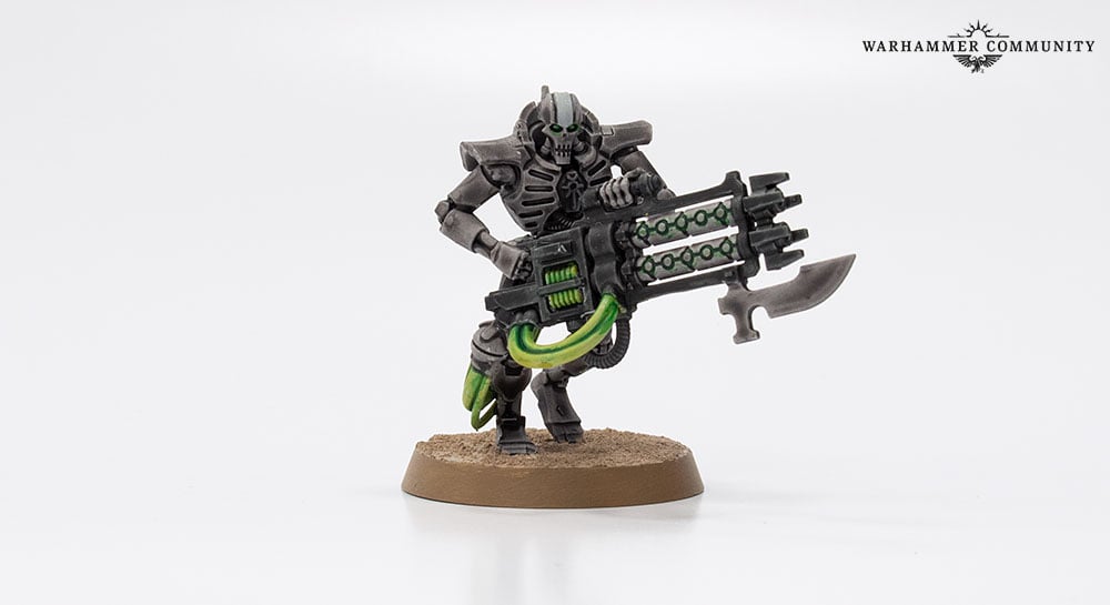
...If you ask me, it's also been cleaned up as well with Nuln Oil, and the Black gun...I'd bet has an edge highlight on it as well.
But yeah. The best you're gonna get is what used to be called 'Ceramic' Necrons.
That's Astrogranite. Originally Posted by Voidhawk
Agrax is the brown wash, one of the two 'Liquid Talents' - the other being Nuln, of course.
As someone who paints Necrons too, I haven't found them too difficult to paint as is. Their monochromatic bodies with many edges and raised areas makes them perfect for drybrushing.
Leadbelcher > Nuln > Drybrush > Drybrush.
Not including the dry-time on the wash, I have an entire 12-man Warrior box done in less than an hour. 60 minutes divided by 12 models? Yeah...Less than 5 minutes per model sounds about right for Necrons to get the bright silver.
...The hard part on my Necrons is painting the yellow armour plates after the black undercoat.
One of my favourite models I've ever painted
Spoiler

...All of the blue orbs have a coat of 'Ardcoat, which is kind of annoying with the lighting 'cause it looks like I've painted two white dots....Which would be dumb. I should take another photo in natural lighting...In fact I will do that...Tomorrow.Last edited by Cheesegear; 2019-06-10 at 06:20 AM.
Spoiler: My Mum Says I'm Cool Originally Posted by Anuan
Originally Posted by Lycan 01
Originally Posted by MeatShield#236
Originally Posted by Shas'aia Toriia
-
2019-06-10, 09:37 AM (ISO 8601)Ogre in the Playground

- Join Date
- Oct 2012
Re: Warhammer 40K Tabletop Thread XXXVII: Highlighting the Contrasts
From what I've seen, it will be extremely good for cloth, fur, and skintones (the Guilliman Flesh in particular gives a good look that was previously quite finnicky) and mostly useless for large swaths of armor or plates. The stupid thing is that the stores are previewing it on Stormcast and Primaris which have... armor and plates.
The Fellowship models they showed on the Community site done with Contrasts look solid, because cloth done with just base + wash previously was already most of the way to done depending on how much you enjoy highlighting folds. My Savage Orruk army for Sigmar I could see just slapping on the Camo Contrast and then handpainting tattoos. A horde of Termagants can probably be done entirely in Contrast since there's few wide flat plates, but you'll want to spend more time on Carnifexes and Tyrants... which you were probably going to do anyway for your big centerpiece models.
I'm getting some just to knock out the small backlog of board games I have - Warhammer Quest (both), Underworlds, maybe a Blood Bowl starter.
As an aside, has anyone flipped through Kill Team Elites or are we just completely done with KT for the time being? It's kinda died out over here other than a casual game when you don't have a full 40k/AoS night.Last edited by Requizen; 2019-06-10 at 09:38 AM.
-
2019-06-10, 10:27 AM (ISO 8601)Titan in the Playground
- Join Date
- Jan 2008
Re: Warhammer 40K Tabletop Thread XXXVII: Highlighting the Contrasts
I have literally not looked through Commanders or Elites. Not even once. Originally Posted by Requizen
I meant to go through the Kill Team results from BAO (they're also up to 125 Points)... I just...Didn't.Spoiler: My Mum Says I'm Cool Originally Posted by Anuan
Originally Posted by Lycan 01
Originally Posted by MeatShield#236
Originally Posted by Shas'aia Toriia
-
2019-06-10, 11:50 AM (ISO 8601)Ogre in the Playground
- Join Date
- Oct 2012
Re: Warhammer 40K Tabletop Thread XXXVII: Highlighting the Contrasts
This is my fear with Warcry as well... Anything that isn't 2000 point 40k or AoS just doesn't last around here (or from the sounds of it, much anywhere else). Everything else ends up niche at best, other than the hardcore anti-GW people still trying to make Kings of War, Infinity, and Malifaux work. Originally Posted by Cheesegear
Sometimes I look at my Kill Team Arena box and sigh melodramatically to myself.
-
2019-06-10, 12:14 PM (ISO 8601)Banned
- Join Date
- Jun 2010
- Location
- Lima, Peru
- Gender
Re: Warhammer 40K Tabletop Thread XXXVII: Highlighting the Contrasts
We just played last week, used Custodes and sub-factions rules, stuck with mostly same old KT. It needs a lot of championing, but 'casual wargaming' is a niche within a niche, so its hard for it to survive long. Which is why I dislike sub-games so much, it ends up with people getting stuck with unused junk. Originally Posted by Requizen
Then again, "Kill Team in corridors only, no vertical fun allowed" supporters deserve what they get :v.
-
2019-06-10, 12:51 PM (ISO 8601)Ogre in the Playground
- Join Date
- Oct 2012
Re: Warhammer 40K Tabletop Thread XXXVII: Highlighting the Contrasts
Hey, don't make fun of Arena, it's actually a really good game Originally Posted by LansXero
 Verticality is cool and thematic, but unbalanced AF unless someone meticulously builds good tables for every game, it gets really screwy real fast.
I've enjoyed championing for some games - Underworlds being the main one, and it's come and gone - but at some point you don't want to be the guy trying to make things work when no one seems interested. If KT crops up again, I'm more than happy to participate, but I just don't have it in me to shill another game.
Though KT is a great reason to snag some Contrast paints and have some small painting projects every now and then

 Reply With Quote


 RSS Feeds: